We have previously looked at the impact of El Nino on precipitation. It was in THIS article. The key graphic was

Now we look at the impact of El Nino on snowfall. Even in the winter, not all precipitation falls as snow. This article is based on a blog post in ENSO BlOG at Climate.Gov by Michelle L’Heureux and Brian Brettschneider. We are only going to present the four key graphics in that Blog Post

You can read the full ENSO BLOG post HERE For some readers, you will have to hit “Read More” to see the rest of my article.

First, let me clarify that this is not the forecast for this winter but a statistical analysis. We have published the precipitation outlook for this summer and you can access that article HERE. Elsewhere NOAA may have published a snow analysis for this winter but I have not seen it.

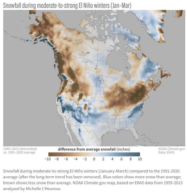
| I have some concerns about the methodology used but it may be related to the wording in the discussion. Assuming everything was done correctly this shows how snowfall in an El Nino winter differs from snowfall in an average year. The units seem to be in units of snow which is strange as usually the snow water equivalent (SWE) is used as some snow is wetter than other snow. I suspect the answer relates to the database used and it is probably easier to compile information on inches of snow than the water equivalent per inch of that snow. Ten inches of snow is only about an inch of water so the difference does not seem to be very much but you can clearly see where there tends to be more snow and where there tends to be less snow than an average year. |

| This refines the analysis to moderate to strong El Nino winters. We may have an even stronger El Nino but this is possibly the best way to look at things. |

| As shown in the graphic at the beginning of the article, El Nino winters vary. The gray areas show where the chances of above-average snowfall are better than 50 percent. From this graphic, you can draw the conclusion that the areas prone to more snow probably have some years with a lot of snow for this graphic to be correct. I think the first graphic in this article shows that also if you look at the individual El Nino years focusing on the moderate to strong El Nino years. As you can see this sort of analysis gets complicated which is why this analysis is important. |

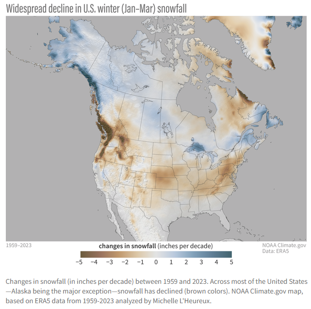
| This perhaps is the most important graphic in the blog post showing the trend for declining snowfall. The legend says inches per decade but I still do not know if this is inches of snow or inches of the water equivalent of the snow. I have posted a question on this in the comments section of the Blog Post and if there is a reply I will post the result of that contact in the comment section of this article. Either way, there is a declining trend which can be caused by less precipitation but most likely is caused by the change in the ratio of snow to rain due to Global Warming when there is precipitation. |
–
| I hope you found this article interesting and useful. |
–