A valuable function not provided by the Microsoft spreadsheet program Excel is calculating the area under a curve. This basic function is needed for many quantitative analysis problems when the data does not fit a defined algebraic function.
Credit: Clipped from a photo by Isaac Smith on Unsplash1
Introduction
When dealing with observed data in medical, life, and social sciences, the measurements are for factors that often do not have a governing theory or law. Thus, quantitative analysis of such data is hampered because it cannot be fitted to an established functional formula.
In physics, we have Newton’s laws of motion, for example, which enable changes in the positions of objects in time and space to be characterized by established equations relating to mass, force, energy, velocity, and acceleration.
In fields characterized by things like cells and life forms, behaviors often have no similar established functional formula with which to fit data. This makes quantitative comparisons of experimental data more problematic. Thus, we may have a carefully measured collection of data and some “pretty” graphs, but interpretation may be difficult. In this short piece, we discuss some approaches to interpreting experimental data, especially for comparisons of results among two or more experiments.
Integration
When the data fit an algebraic equation, like y = x2 + x + 1, the area under any portion of the plot of y vs. x can be calculated via integration.2 For example, the area under the curve between values of x between 1 and 2 is calculated by
∫x=1x=2y(x) dx = ∫x=1x=2(x2 + x + 1) dx
= (1/3) x3+ (1/2) x2 +x |12
=[8/3 + 4/2 + 2] – [1/3 + 1/2 + 1]
= 7/3 + 3/2 + 1
= 29/6 (or 4.833…)
If, for example, the equation represents the unchecked growth of a new asexual population if introduced to a new environment with no predators, the answer above shows the number of the species produced in the second year (1 of the species was introduced at t=0).
Some other examples (from Revision Maths3):
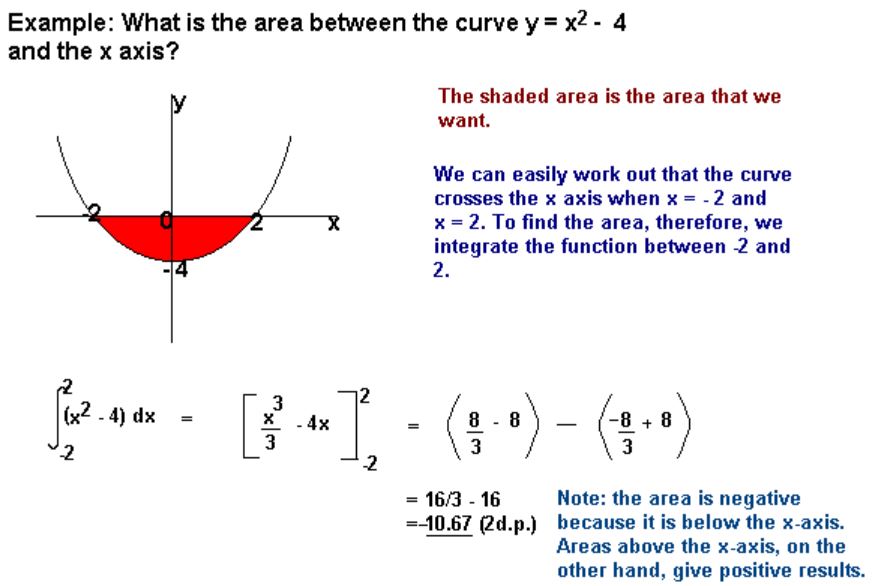
The statement above has an error stating areas above the x-axis are positive and below are negative. The correct explanation would be that areas under the x-axis are considered negative for positive values of x because y is negative (x*(-y) = -xy). But when x is also negative, the area is positive because both of the dimensions are negative ((-x)*(-y) = +xy).
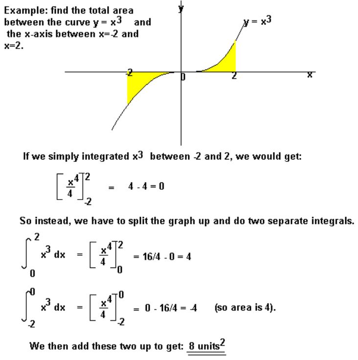
In the above example, both of the areas are properly identified as positive.
Counting ‘Graph Paper Segments’
One method often used when a graph image has closely spaced grid lines involves counting the number of defined grid areas incldued under a curve. Below is a sample segment of a graph with many grid lines.

To expand for better resolution, let’s look at just the first peak:

Estimated areas starting from the top: 0.05 + 0.1 + 0.15 = 0.3 rectangles down to 60%. Continuing down, 0.2 + 0.27 + 0.35 + 0.43 + 0.5 = 1.75 below 60%, and down to 50%. Next 0.58 + 0.67 + 0.76 + 0.88 + 1.0 = 2.15 below 50% and down to 40%. Continuing down, 1.1 +1.17 + 1.25 + 1.36+ 1.4 = 6.29 below 40% and down to 30%. Then, 1.54 + 1.68 + 1.82 +1.96 + 2.1 = 9.1 below 30 %, down t0 20%. Next, 2.18 +2.27 + 2.35 + 2.42 +2.5 = 11.72 below 20%, and down to 10%. Finally, 2.6 +2.7 +2.8 +2.9 +3.0 = 14.
The total of the seven segment areas from above is 0.3 + 1.75 +2.15 + 6.29 + 9.1 + 11.72 + 14 = 45.31 –> 45.3 grid units. Each grid unit is 2% tall and 0.5 year wide, so the area is 1 percent-year. Then the area under the curve is 45 percent-years and that covers the time period of 1.5 years. Dividing 45 percent-years by 1.5 years indicates that the average per annum for the time period is 30%, with a maximum of ~63% in the summer of 2016 and two minima of 0% at the start and the end of the 1.5 year period.
The short-coming of using this method for data displayed in the manner of the example used is that the fractional grid areas are very difficult to estimate and much tedium is involved. Some of the measurement errors will average out, but we cannot be sure how much remains.
Use Geometric Shapes
For many graphs, dividing the area under the curve into simple geometric shapes is a good way to measure area. Two common area shapes found in graphs are triangles and trapezoids.
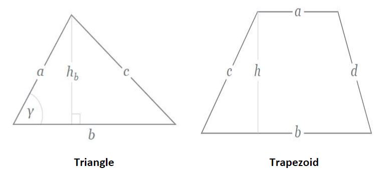
Area of a triangle = hb b / 2
Area of a trapezoid = h (a+b) / 2
Note: Trapezoids include the shapes of squares and rectangles.
Use of triangles
Let us repeat the previous graph clip using a different Excel graph format showing vertical lines for every year whenever they fall within area “under the curve.”

The shape defined by the first data in the timeline (the same data considered in the previous section) is a triangle. The measurments of this triangle are hb = 0.63 (a data point) and b = 1.4, estimated by interpolation. The interpolation estimates the triangle intersects the x-axis slightly less than halfway between 1917 and 1918. So the area of this triangle is 0.63 x 1.4 / 2 = 0.44 units (93%). The units here are percent-years. Accumulated over 1.4 years, the average per annum is 31.4 percent-years per year = 31.4%.
The result above is close to the 30% number found in the preceding section. We submit that the result in this section is more accurate in light of the more precise measurements. There is much less time and tedium involved in this method as well.
Use of trapezoids
Below we have another plotted area from the same graph as above:
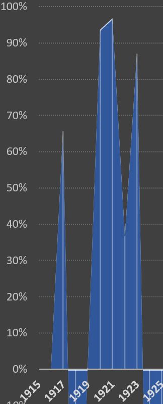
Now we focus on the multi-year plot to the right of the triangle we analyzed above (1919 to some time in 1923). Starting from the left, the first shape is a triangle, the next three are trapezoids, and the fifth is another triangle.
First triangle
The base is 1 year and the height is 93%, so the area is 1 x 93 / 2 = 46.5 percent-years.
Three trapezoids
Trapezoid 1 has b = 1, a = 93%, and b = 96%. Thus, area = (93 + 96) x 1 / 2 = 94.5 percent-years.
Trapezoid 2 has b = 1, a = 96%, and b = 37%. Thus, area = (96 + 37) x 1 / 2 = 66.5 percent-years.
Trapezoid 3 has b = 1, a = 37%, and b = 87%. Thus, area = (37 + 87) x 1 / 2 = 62 percent-years.
Final triangle
The base is 0.5 years (by interpolation) and the height is 87%, so the area is 0.5 x 87 / 2 = 21.8 percent-years.
The total for the above area is 291.3 percent-years. The time interval is 4.5 years. Thus the average per annum over the 4.5 year interval is 64.7%. Included in this average are data points and interpolations that span the range from 0% to 96%.
The ease of measuring area under a curve in this manner makes it a preferred method. In addition, since so many of the points defining the shapes are actual data points, the accuracy of this method is another advantage.
Other Methods
The most common method other than those discussed above uses a class of devices called ‘planimeters’. Examples of a number of types of these mechanical devices are shown in Wikipedia.4
A precision mechanical planimeter used in engineering work was found for sale on EBay.5
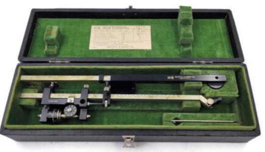 K+e Keuffel & Esser 4242 Compensating Polar Planimeter Drafting Engineering Tool, for sale on Ebay.5
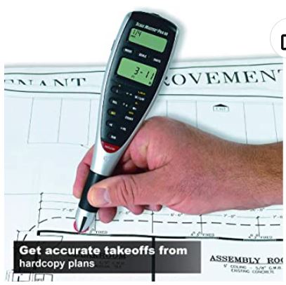
There are also hand-held digital planimeters such as the one shown below, available at Amazon.6
Calculated Industries 6135 Scale Master Pro XE Advanced Digital Planimeter, for sale on Amazon.6
In general, planimeters are not very useful for the size image displayed on a computer screen. The are useful for large blueprint images, especially for things like landscaping with irregular shaped areas.
Conclusion
Measuring areas under irregularly shaped curves is a useful method for obtaining information that would be obtained by calculus (integration) if a functional equation were available. Many of the time series available for economic analysis do not fit defined algebraic functions. As we have seen here, the use of geometric shapes to define areas under a curve can be both accurate and convenient for that purpose.
Footnotes
1. Smith, Isaac, Kansas City, Mo, Photos on Unsplash. https://unsplash.com/@isaacmsmith.
2. See any calculus text book. For example, Strang, Gilbert, Calculus, Wellesley-Cambridge Press. Second edition (2010).
3. RevisionMaths.com. https://revisionmaths.com/advanced-level-maths-revision/pure-maths/calculus/area-under-curve
4. Planimeter, Wikipedia, https://en.wikipedia.org/wiki/Planimeter.
5. K+e Keuffel & Esser 4242 Compensating Polar Planimeter Drafting Engineering Tool, Ebay. https://www.ebay.com/itm/304692899073
6. Calculated Industries 6135 Scale Master Pro XE Advanced Digital Plan Measure for Estimating Plan Takeoffs on Printed Blueprints | 91 US Imperial and Metric | 10 Custom Scales for Out of Scale Plans , White, Amazon, https://www.amazon.com/Calculated-Industries-6135-Advanced-Blueprints/dp/B002O16VLA/.
Pingback: Government Spending and Inflation. Part 6 - EconCurrents