On the third Thursday of the month right on schedule NOAA issued their updated Seasonal Outlook which I describe as their Four-Season Outlook because it extends a bit more than one year into the future. The information released also included the Mid-Month Outlook for the following month plus the weather and drought outlook for the next three months. I present the information issued by NOAA and try to add context to it. It is quite a challenge for NOAA to address the subsequent month, the subsequent three-month period as well as the twelve successive three-month periods for a year or a bit more. A seasonal drought outlook is also issued.
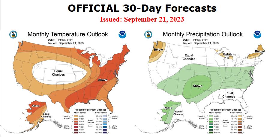
First, Let’s Take a Look at the (mid-month) Outlook for October. It will be updated on the last day of September.
Then I present a graphic that shows both the preliminary Outlook for October and the three-month outlook for OND 2023. So you get the full picture in one graphic. For some, that may be all they are interested in. Others will be interested in the longer-term predictions and also the rationale supporting the predictions which is mostly provided by the NOAA discussion.
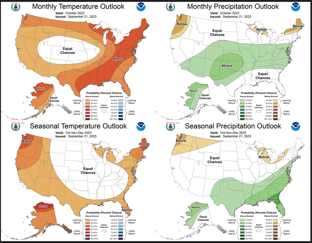
The top row is what is now called the Mid-Month Outlook for next month which will be updated at the end of this month. There is a temperature map and a precipitation map. The second row is a three-month outlook that includes next month. I think the outlook maps are self-explanatory. What is important to remember is that they show deviations from the current definition of normal which is the period 1991 through 2020. So this is not a forecast of the absolute value of temperature or precipitation but the change from what is defined as normal or to use the technical term “climatology”.
| Notice that the outlook for next month and the three-month outlooks are somewhat different with respect to temperature. This tells us that November and December will be different than October to some extent. |

The full NOAA Seasonal Outlook extends through October/November/December of 2024. All of these maps are in the body of the article. Large maps are there for October and the three-month period Oct/Nov/Dec. Small maps are provided beyond that through December of next year with a link to get larger versions of these maps.
NOAA provides an excellent discussion to support the maps and the changes which starting in the Spring of 2024 are significantly different from what was issued a month ago. [Author’s Note: many other meteorological agencies see this El Nino lasting longer than NOAA does so there is more than usual uncertainty relating to the more distant months. It seems to me that NOAA was showing some of these as El Nino months last month but has changed them to ENSO Neutral months in what they issued on September 21, 2023.]


![[Key Messages]](https://www.nhc.noaa.gov/storm_graphics/AT16/refresh/AL162023_key_messages+png/024246_key_messages_sm.png)

