EIA the U.S. Energy Information Agency has issued their Monthly Energy Review.
In this article, I present selected tables and graphics from the EIA Monthly Energy Review. My comments as usual are in a box.
At the end of the article, I provided a link to the full Monthly Review. The EIA Monthly Energy Review is separate from its annual reporting on crude oil and natural gas reserves. My article on their estimates of reserves can be accessed HERE.

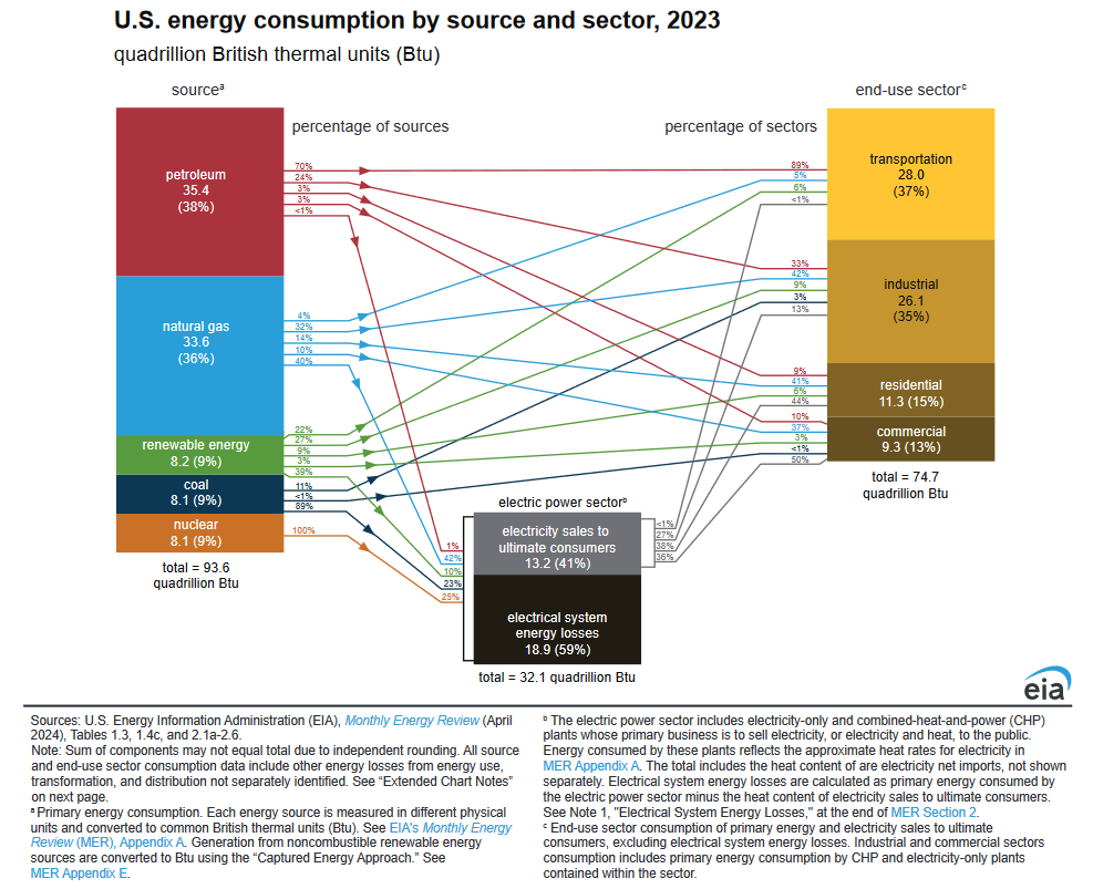
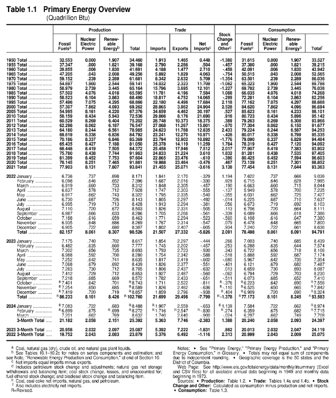
| There are a number of graphics like this that show the source of the energy and where used. As a bonus, this graphic also shows transmission costs for electricity which is more than the amount of electric energy that makes it to the end user. Notice the small contribution of renewables. Notice the large contribution of natural gas of which the U.S. has substantial reserves. |
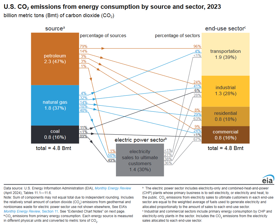
| This shows the emissions of greenhouse gases (actually only carbon dioxide. Not surprisingly, the transportation sector is where most emissions are released. |
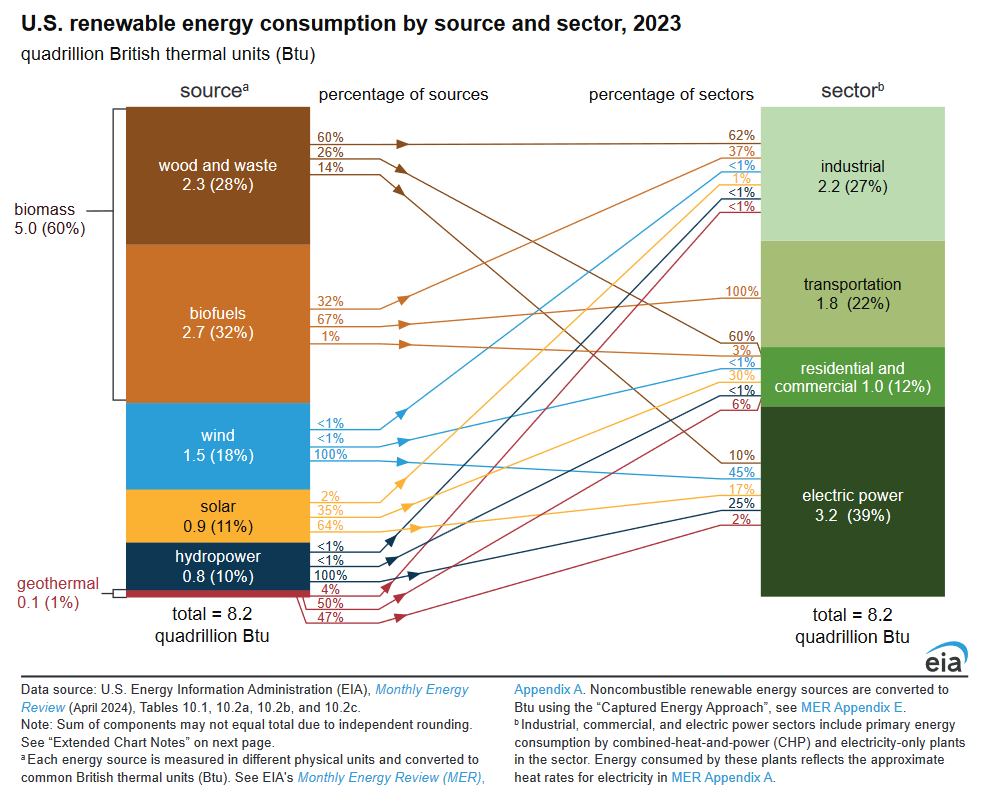
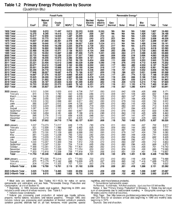
| Again you see the small contribution of wind and solar both of which are dominated by using wood which is kind of pathetic. The electric power industry uses a lot of energy to make electricity. |
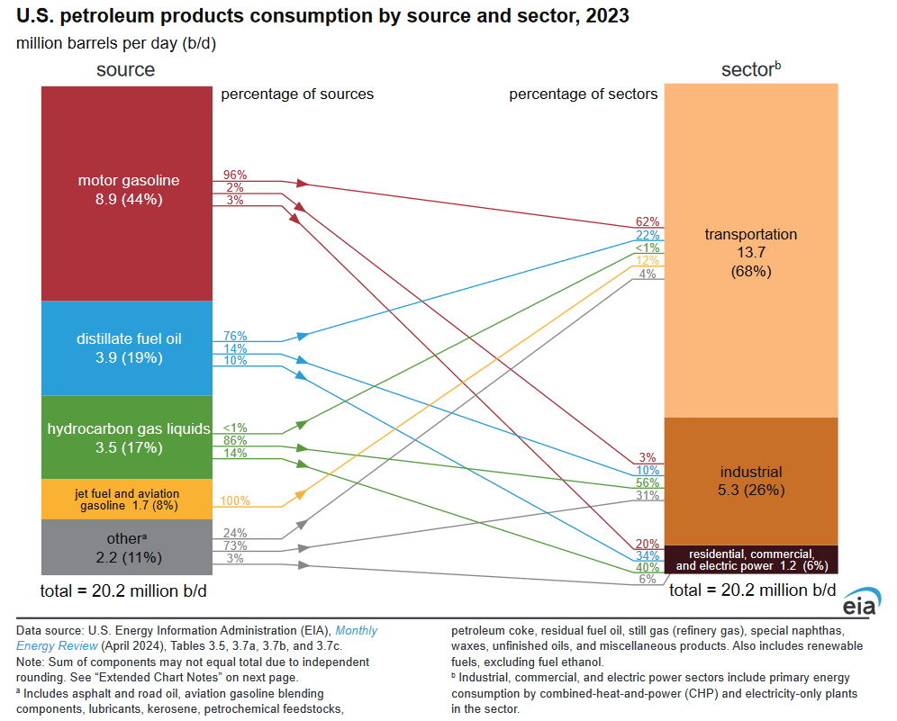
| Here they look at petroleum products, not raw crude oil, and look at where they are used: Transportation. Will electric vehicles improve the situation? Probably not depending on how the electricity for electric vehicles is generated. |
Some readers will need to click on “Read More” to access the remainder of this article.
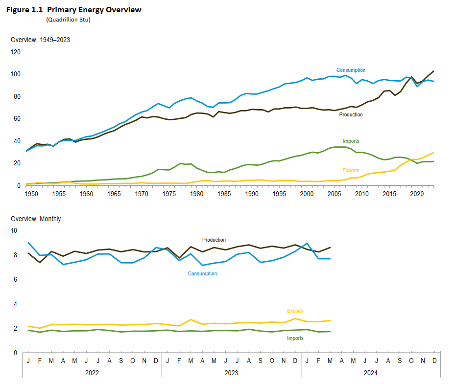
| Here I provided the data table from the June EIA Review and also a graphical presentation of the data. It shows the U.S. becoming self-sufficient in energy which you can see most clearly in the import and export numbers. The top graph might be the most useful. |
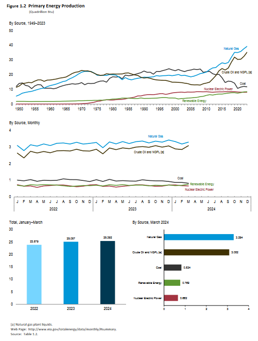
| You can see the increase in crude oil and natural gas production that has made the U.S. energy independent. |
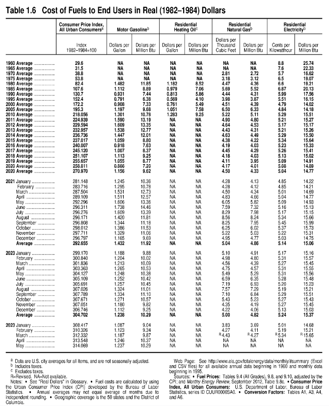
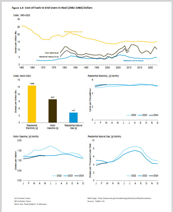
| EIA provides a lot of data and many different ways to look at the data. In the above graphic, the yellow line is the cost of residential electricity which declined for many years but now is no longer declining. This is a big deal. |
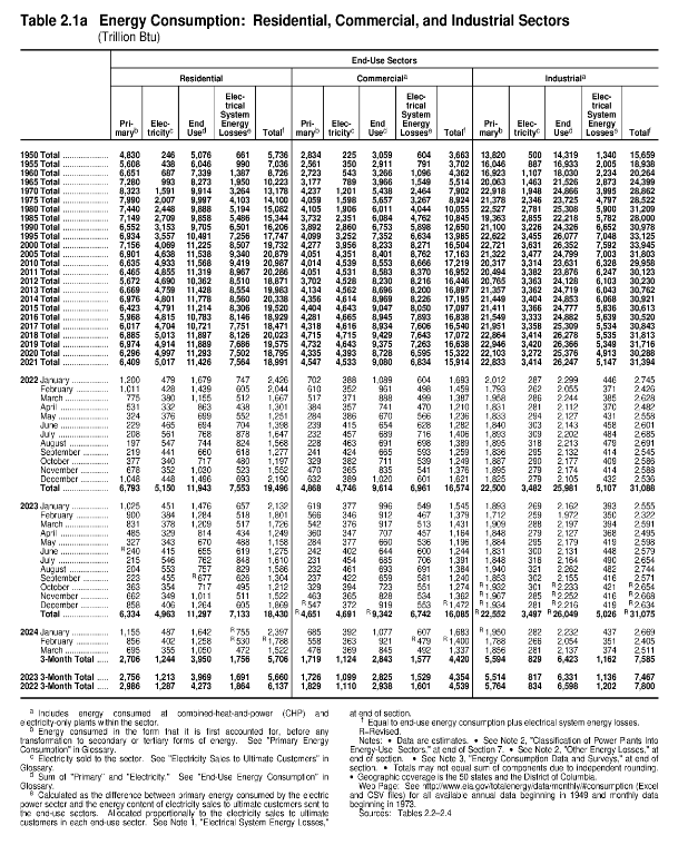
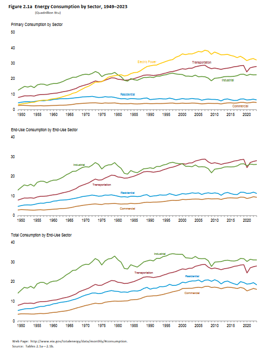
| This focuses on where energy is consumed. |
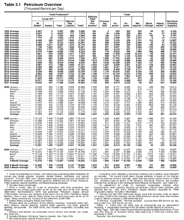
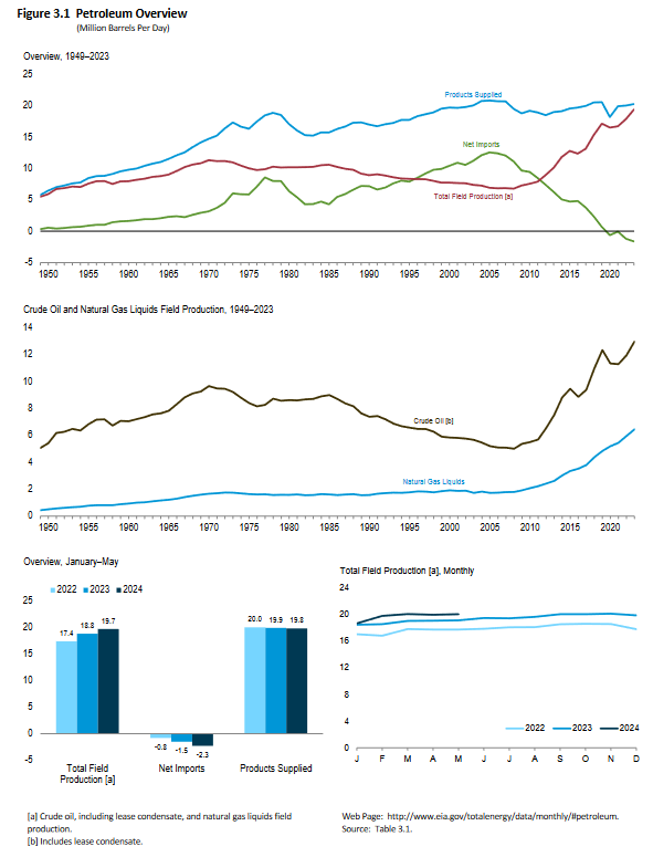
| This focuses on Petroleum. EIA breaks the information down in many different ways. There is a lot of redundancy in the EIA data and it shows up here in the import-export data. |
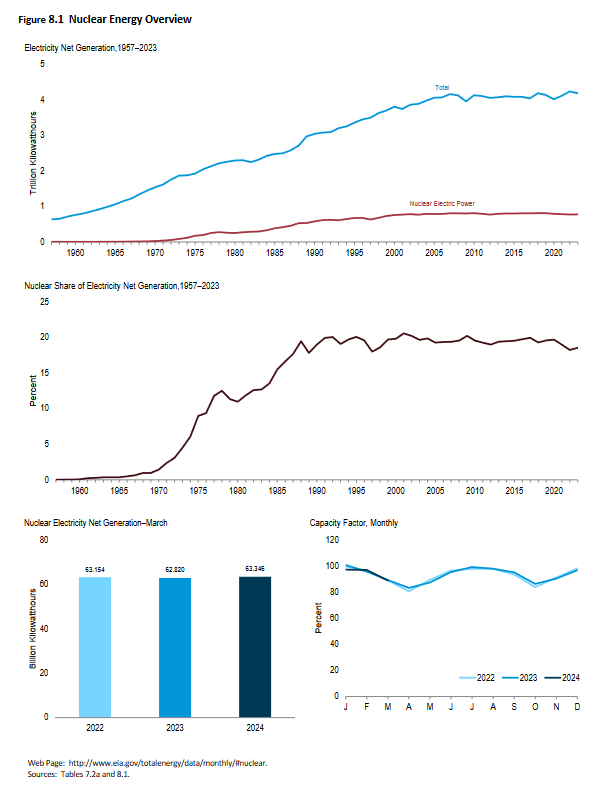
| This focuses on Nuclear Energy. Since 1990 it has not grown. |
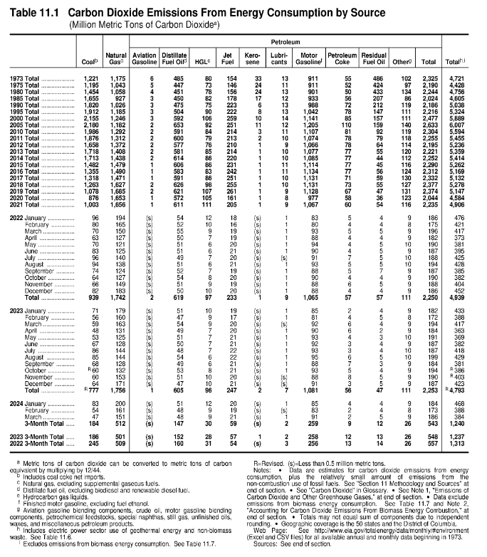
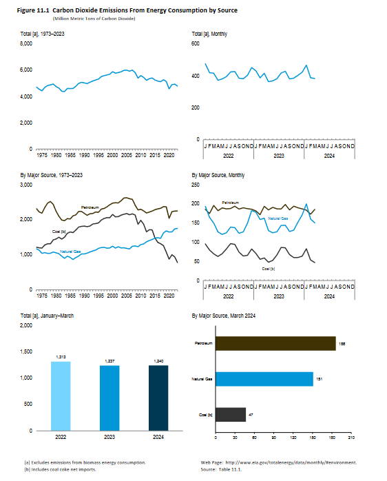
| This focuses on carbon dioxide emissions. They have remained fairly constant but you can see that we have less emissions from coal but more from Natural Gas that has replaced coal in many plants that generate electric power. |
You can access the EIA Monthly Energy Report HERE or HERE.
–
| I hope you found this article interesting and useful. |
–