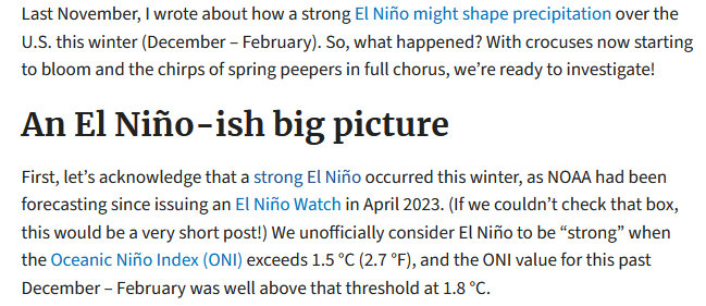
There was a very interesting blog post on ENSO.Gov that tries to assess this El Nino in the context of other El Ninos and I think they have done a very good job. I have reproduced the blog post in this article. Those who want access to any comments that have been submitted to that blog post can find the post HERE. Remember that all posts on the Climate.Gov ENSO Blog are attributed to the author who in this case is Nat Johnson. All the ENSO Blog posts are excellent. This one is beyond excellent.
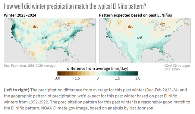
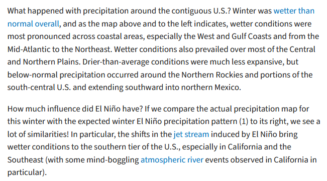
| The above shows that the current El Nino which is winding down has been pretty close to what would be expected from a typical El Nino. It also shows how both the typical El Nino and the current El Nino compare to Normal or Climatology. You can easily see the differences. The analysis is for the Meteorological Winter months of December through February. |
There is a lot more to this blog Post so some readers will need to click on “Read More” to access the rest of this very interesting analysis. If you accessed this article via the url you will already have the full article and will not need to click on “Read More”.
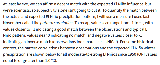
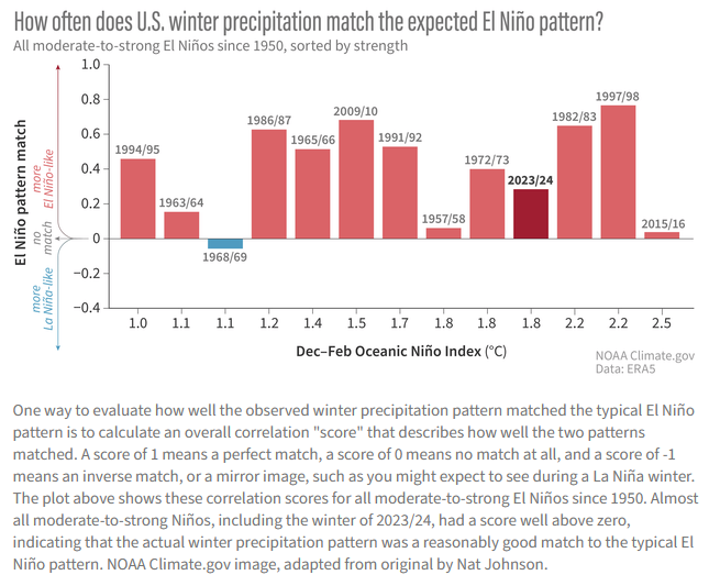
| The above is very interesting. It is showing only the moderate to strong El Ninos and showing how well they match the typical El Nino pattern. I can not immediately detect a pattern here. There appears to be a slight tendency for the more powerful El Ninos being a better match but the 2015/2016 which was the strongest El Nino was hardly a match at all. And the correlation is for the entire U.S. which probable means CONUS but may include more of the U.S. but I do not believe that this was specified. My conclusion is this El Nino was somewhat of a bust. El Nino is not static as there is much variability but we have not really determined if there is a trend. |
| This is using a different approach as it is not comparing the actual to the typical but looking at the actual to forecast. And it is using a particular forecast model. But to me it is a very interesting analysis. |
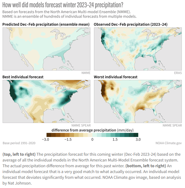
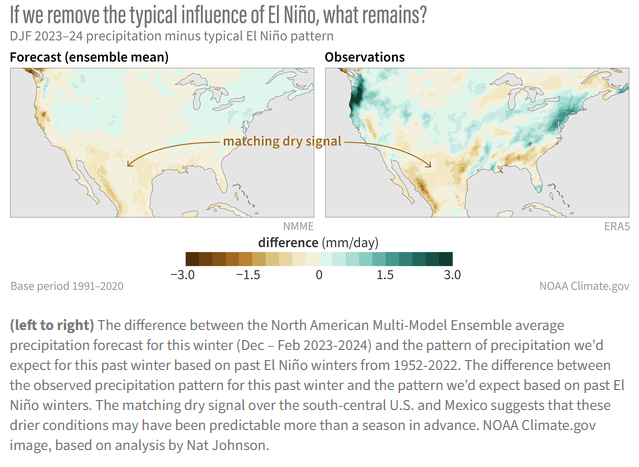
| Now Dr. Johnson does something else. He compares the actual to a forecast that assumes perhaps ENSO Neutral. I believe the Legend does not accurately describe the image or do not understand what I am looking at which is quite possible. If the images are what the caption (not the Legend) says they are, the forecast on the left shows the Climate Change contribution to this El Nino. I will probably try to communicate with the author on this graphic. |
| I need to read his November Blog Post and that might clarify some things. But I think I need to write to the author about a few things and if I get a response I may add it to this article. |
CLIMAS Podcast. This one is pretty good. As usual it addresses more than just the Southwest as it explains some aspects of the now winding down El Nino. They have a strange way of saying Madden-Julian Oscillation (MJO) and maybe that is how meteorologists shorten it or perhaps it is just how they say it in Aridzona. But they are always fun to listen to and there are no advertisements.
To listen to the podcast click HERE to get the Podcast Dashboard and then click the arrow to start the podcast.
–
| I hope you found this article interesting and useful. |
–


Yes, quite complex but the little I comprehend is quite fascinating. And I’m appreciative of your additional comments. Thank you
Yes, Nat Johnson is sharp. It is interesting to compare weather patterns from year to year. I have written to Dr. Johnson about the wording in the last graphic and some ideas for additional analysis. But I have not yet heard back. His analysis suggests that this El Nino did not measure up to its Nino 3.4 Index. The podcast from Climax confirms that for Arizona and New Mexico. It is challenging to compare things in meteorology because the topography of the U.S. is complex and many factors influence weather.