The full data sets for the 71 years from 1952 to 2022 show no discernable association patterns (correlations) for household credit growth and inflation changes.1 This post continues that analysis by looking specifically at the various regimes of inflation change during the 71-year timeline.

From a photo by CardMapr.nl on Unsplash
Introduction
The 71 years from 1952 to 2022 are divided into three types of inflationary behavior:1
- Significant inflation increases;
- Significant inflation decreases;
- No significant inflation changes.
An inflation change is significant if it is ≥4.0% with no intervening countertrend change >1.5%.
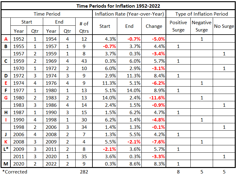
Previously, we defined the partitioning of inflation into the pattern in Table 1.
Table 1. Timeline of Inflation Data 1952-2022 (Previously Table 4*.1)
We will examine each category of inflation behavior separately. In this piece, we analyze the significantly positive periods of inflation (positive inflation surges).
Data
The data is from Tables 5-17, prepared previously.1
There are 13 quarterly timeline alignments:
- HNO Credit and CPI Inflation quarters are coincident.
- HNO Credit leads and lags CPI Inflation by one quarter (±3 months)
- HNO Credit leads and lags CPI Inflation by two quarters (±6 months)
- HNO Credit leads and lags CPI Inflation by three quarters (±9 months)
- HNO Credit leads and lags CPI Inflation by four quarters (±12 months)
- HNO Credit leads and lags CPI Inflation by six quarters (±18 months)
- HNO Credit leads and lags CPI Inflation by eight quarters (±24 months)
Analysis
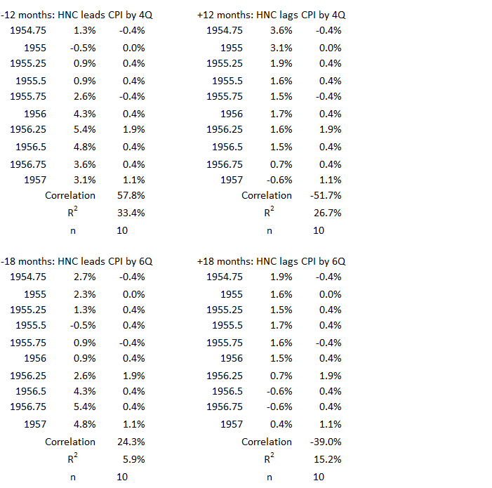
1Q 1955 – 1Q 1957
Figure 1. U.S. HNO Credit and Inflation 1Q 1955 – 1Q 1957
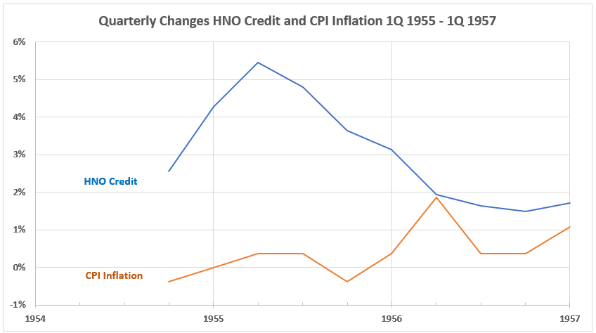
The general observation of this data is that, after the first two quarters where both HNO Credit and CPI Inflation rise, the two trend in opposite directions.
Figure 2. Quarterly Changes in HNO Credit (x) vs. CPI Inflation (y) 1Q 1955 – 1Q 1957

The association (correlation) between HNO Credit and CPI Inflation is weakly negative for this inflation surge period. R = –36%, R2 = 13%.
Figure 3. Correlation Between HNO Credit and CPI Inflation 1Q 1955 – 1Q 1957
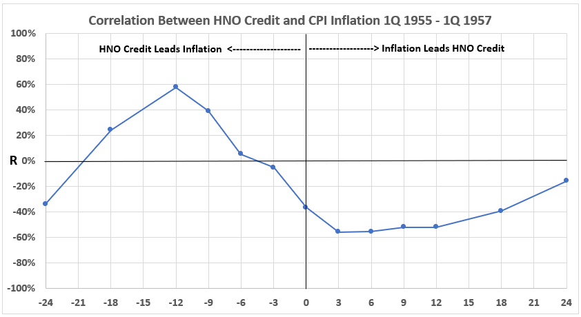
A moderate positive association exists between the HNO Credit data four quarters earlier with CPI Inflation. R = 58%, R2 = 27%. There are weak positive associations for HNO leading CPI by three quarters (R = 39%, R2 = 15%) and six quarters (R = 24%, R2 = 6%). Although this data rules out a major role for HNO Credit as a cause of CPI Inflation in this time period, the possibility of some contribution remains.
The data for CPI leading HNO in time (right-hand side of the graph) indicates that rising CPI might possibly cause reduced HNO Credit. Another reason for the negative association could be that declining inflation (disinflation) could possibly result in increases in HNO Credit. The first of these suggestions is consistent with the use of credit declining when interest rates rise, as they usually do during increasing inflation. The second suggestion makes sense because us of credit should tend to increase when interest rates fall. We do not explore these ideas further in this analysis except to note some other time periods when this may be indicated.
2Q 1959 – 4Q 1969
Figure 4. U.S. HNO Credit and Inflation 2Q 1959 – 4Q 1969
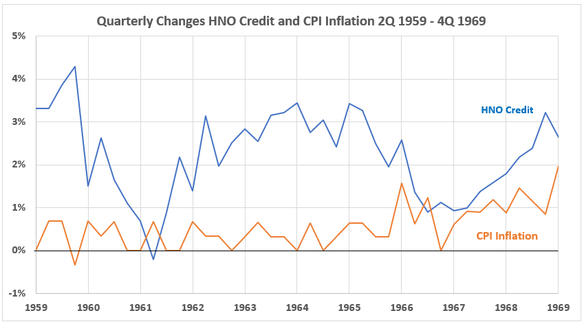
These two variables seem to move quite independently at first glance. However, one can visually detect more negative correlation patterns from 1959-1964 than from 1965-1969. In the latter time, it may seem that there are times when HNO Credit and CPI Inflation are moving in the same direction. We will return to this thought at the end of the analysis for this time period.
Figure 5. Quarterly Changes in HNO Credit (x) vs. CPI Inflation (y) 2Q 1959 – 4Q 1969
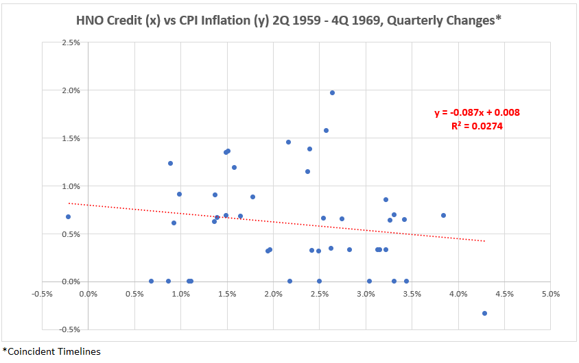
Over this decade, there is a very slight negative association (R = –16%, R2 = 2.7%).
Figure 6. Correlation Between HNO Credit and CPI Inflation 2Q 1959 – 4Q 1969
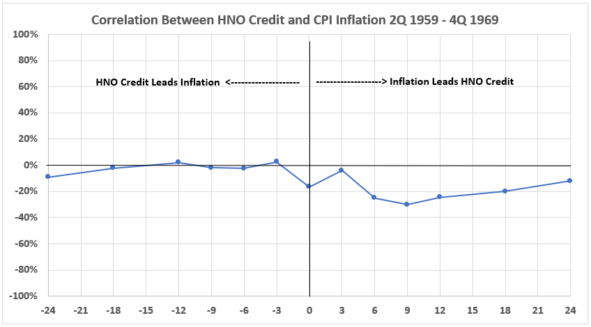
There is negligible positive correlation when NHO Credit leads CPI Inflation in time all the way out to 24 months offset. There are slight negative associations when CPI leads HNO (right-hand side of the graph).
Because of the suggestion that there may be more negative correlations between 1959 and 1964 than for 1965-1969, these two time periods are analyzed separately below.
2Q 1959 – 4Q 1964
Figure 7. U.S. HNO Credit and Inflation 2Q 1959 – 4Q 1964
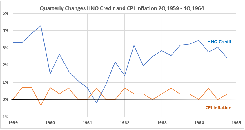
Figure 8. Quarterly Changes in HNO Credit (x) vs. CPI Inflation (y) 2Q 1959 – 4Q 1964
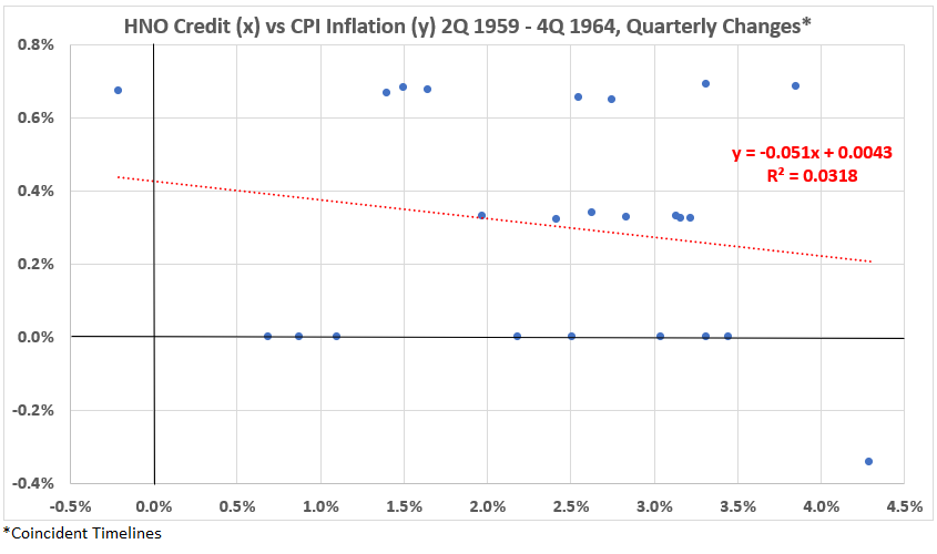
There is very little difference in correlation for this data set compared to Figure 5. Here, R = –18%, R2 = 3.1%.
Figure 9. Correlation Between HNO Credit and CPI Inflation 2Q 1959 – 4Q 1964
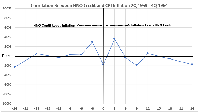
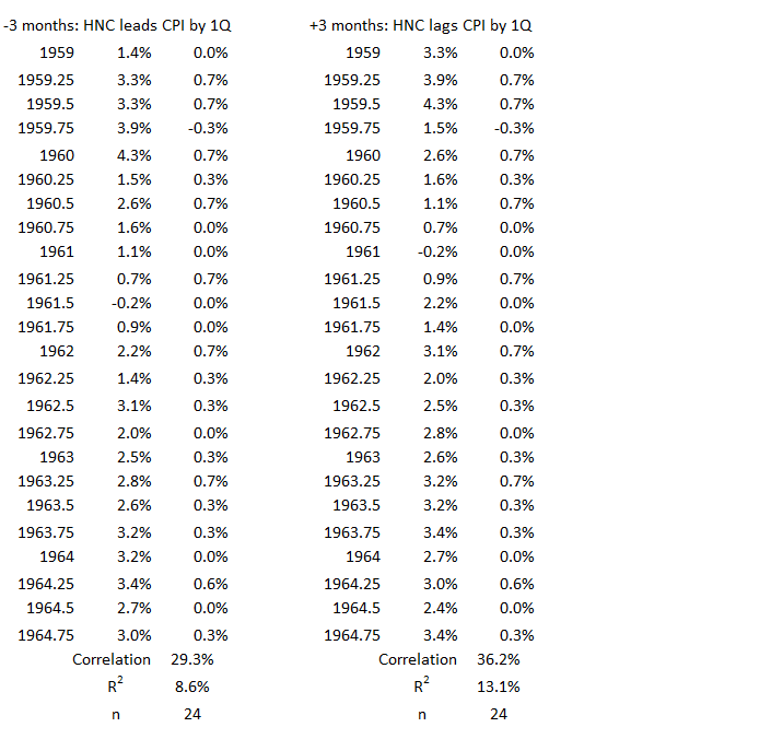
Even though the scatter diagrams show little difference, the data timeline offsets here show different results than in Figure 6. Most notably, there are two weak positive associations (±3 months), and a weak negative association for the coincident data.
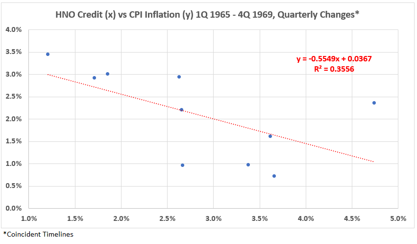
1Q 1965 – 4Q 1969
Figure 10. U.S. HNO Credit and Inflation 1Q 1965 – 4Q 1969
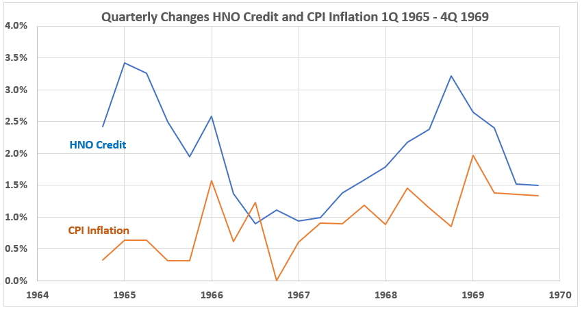
Figure 11. Quarterly Changes in HNO Credit (x) vs. CPI Inflation (y) 1Q 1965 – 4Q 1969
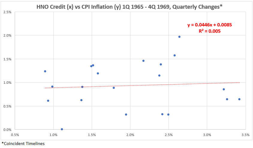
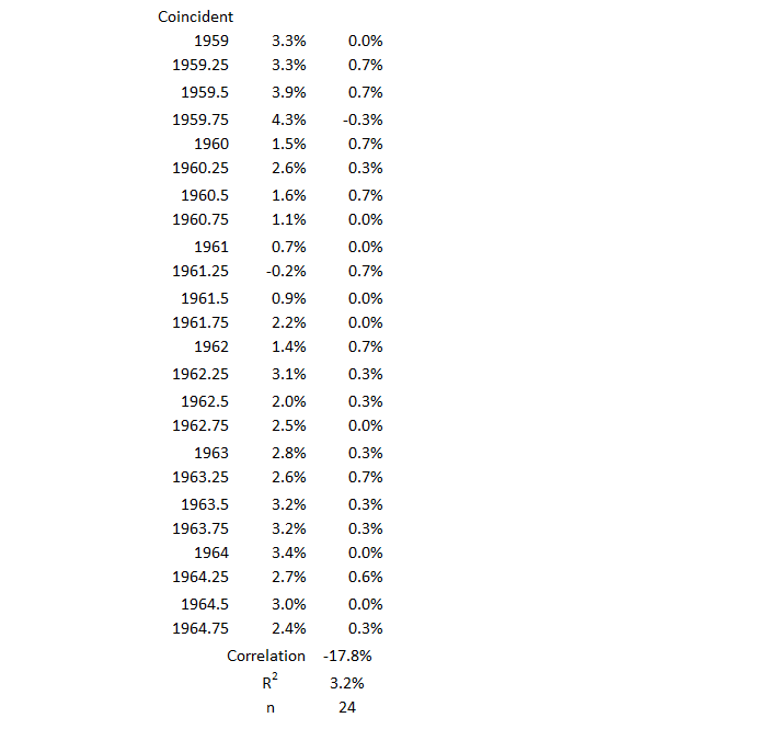
Here, we have a positive (but negligible) correlation for the coincident data, R = 7% and R2 = 0.5%. While this confirms the eyeball estimate noted in the Figure 4 discussion, the result is hardly overwhelming.
Figure 12. Correlation Between HNO Credit and CPI Inflation 1Q 1965 – 4Q 1969
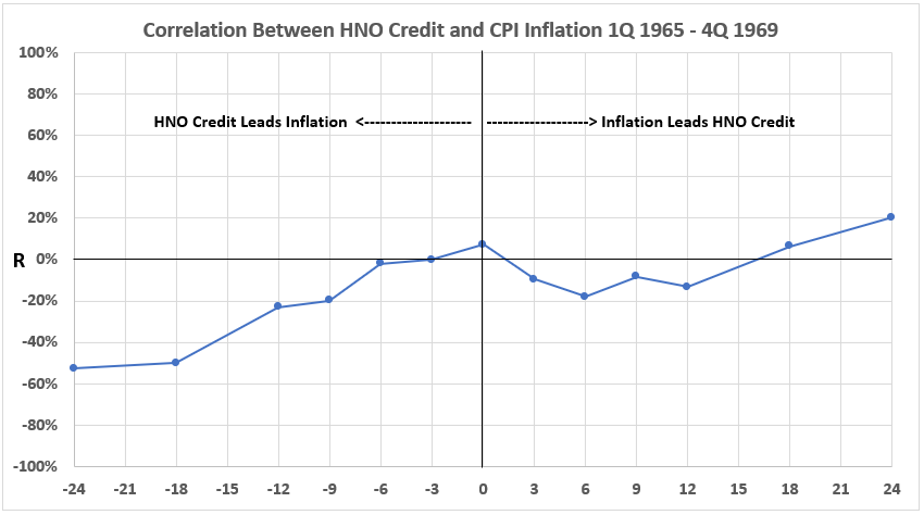
There is an interesting result here. We see moderate negative associations for HNO leading CPI by 18 and 24 months. There are weak negative associations for leads of 9 and 12 months. This could mean either of two things:
- A stronger denial that increasing HNO Credit can possibly cause CPI Inflation or
- An indication that increasing HNO Credit can possibly cause CPI Inflation to decline (disinflation) (or vice versa).
The “vice versa” is the most interesting because the increasing use of credit during disinflation when interest rates tend to be lower is reasonable, as discussed previously.
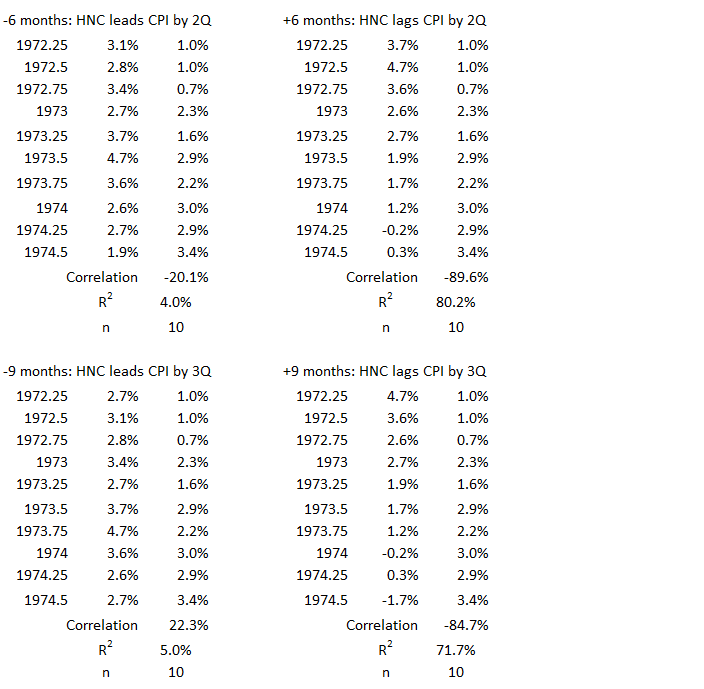
3Q 1972 – 3Q 1974
Figure 13. U.S. HNO Credit and Inflation 3Q 1972 – 3Q 1974
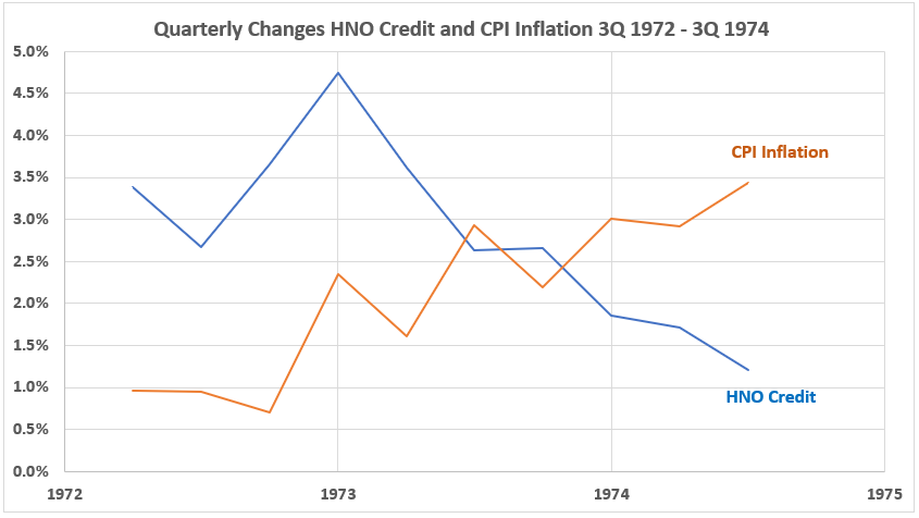
This is a pattern we have seen before (Figure 1). At the beginning, both variables are in an uptrend for three quarters. After that, CPI Inflation continued to rise while HNO Credit declined.
Figure 14. Quarterly Changes in HNO Credit (x) vs. CPI Inflation (y) 3Q 1972 – 3Q 1974
The coincident timeline data shows a moderate negative association (R = –60% and R2 = 36%).
Figure 15. Correlation Between HNO Credit and CPI Inflation 3Q 1972 – 3Q 1974
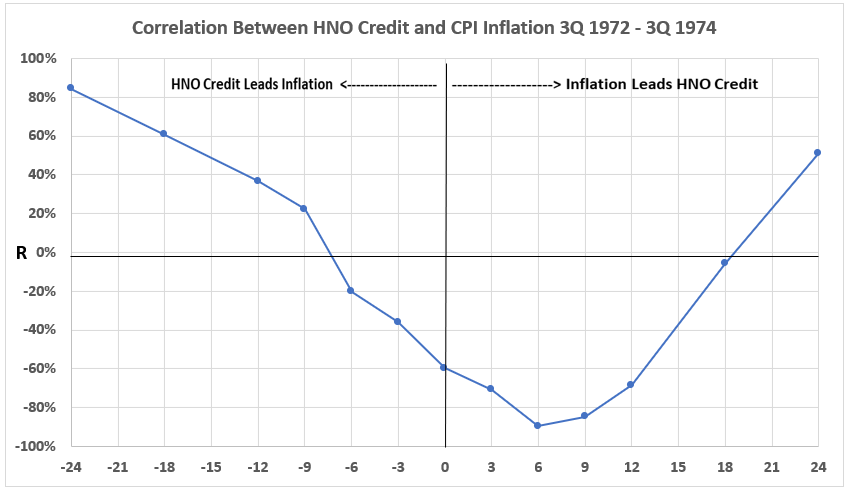
There are two curious results here. First, the positive correlation for HNO leading CPI starts strongly with a 24-month lead time. but then declines steadily to a weak value at 9 months. This is puzzling. If there is cause-and-effect, why would it be so much stronger two years later than only 9 months later?
The second result that does not seem to have an easy explanation is the moderate positive association between CPI Inflation and HNO Credit 24 months later. All shorter lead time correlations are negative, most moderately and strongly so.
We keep these anomalies in mind for future consideration.
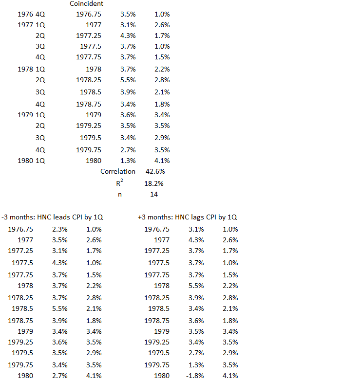
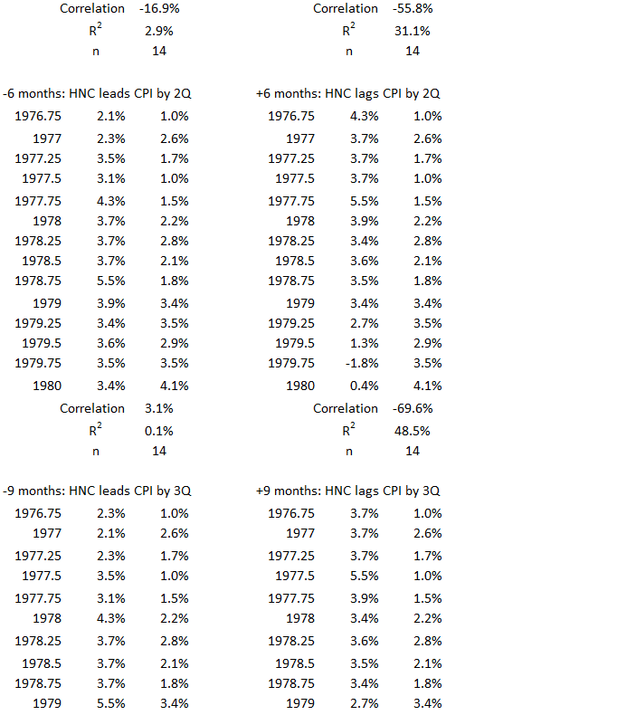
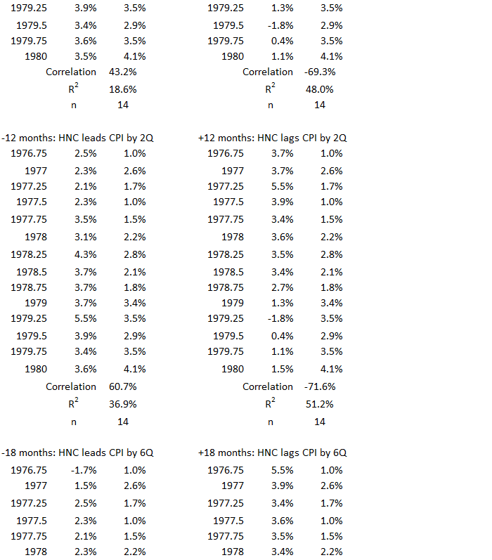
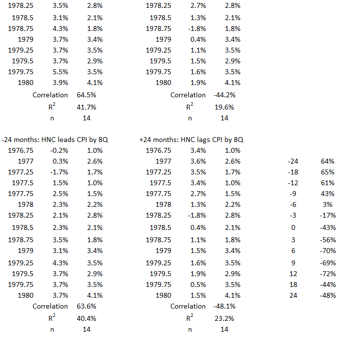
1Q 1977 – 1Q 1980
Figure 16. U.S. HNO Credit and Inflation 1Q 1977 – 1Q 1980
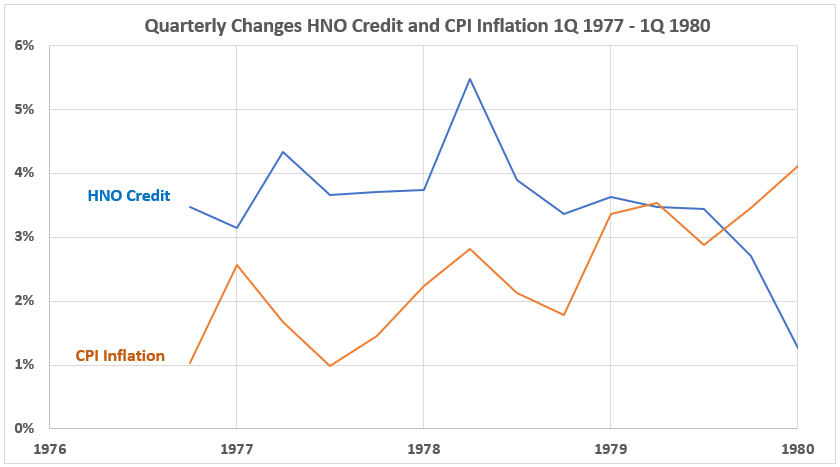
Another graph shows an overall diverging trend direction, although not as strongly divergent as in earlier cases.
Figure 17. Quarterly Changes in HNO Credit (x) vs. CPI Inflation (y) 1Q 1977 – 1Q 1980
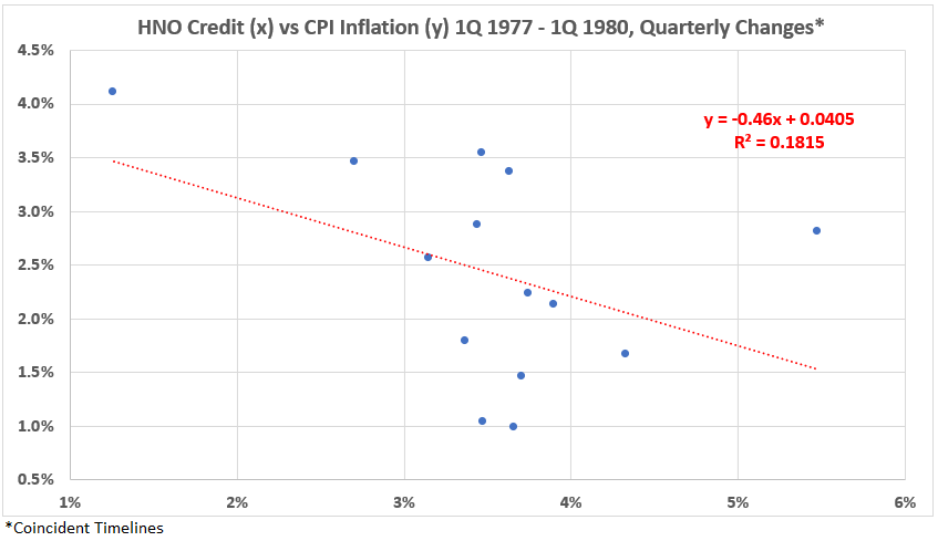
Again, the association between the two variables with coincident timelines is negative. R = –43% and R2 = 18%.
Figure 18. Correlation Between HNO Credit and CPI Inflation 1Q 1977 – 1Q 1980
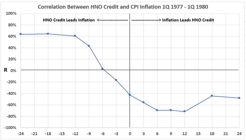
If you wanted a textbook example to indicate possible cause and effect, this result comes close. The only thing that would make it better would be for the moderate correlation levels to continue closer to the coincident (zero vertical) line. Why should it take 9-12 months for increased spending to start to influence inflation?
Note: This is a good time to repeat the caveat: Association (correlation) indicates what is possible, not what is proven.
Again, we have another example of a negative association between CPI Inflation and future HNO Credit (right-hand side of the graph).
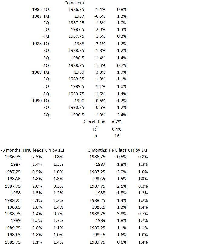
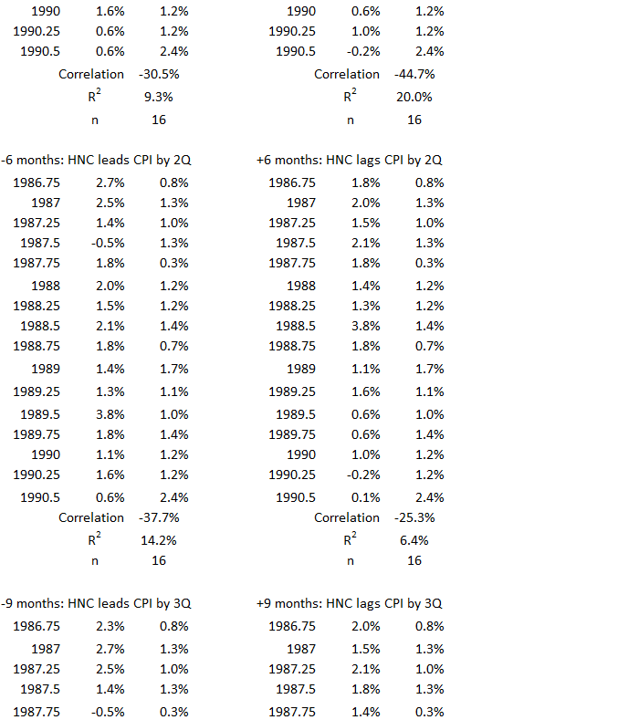
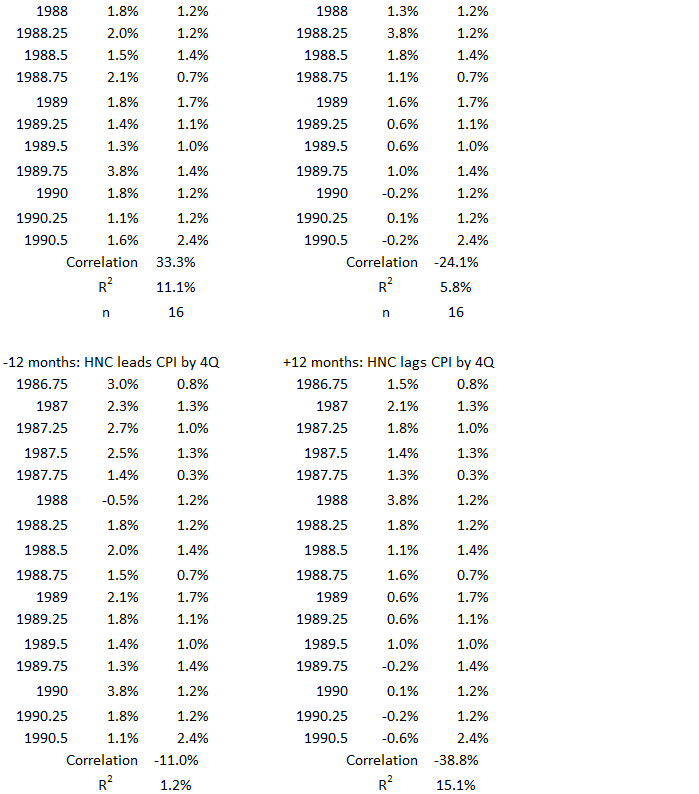
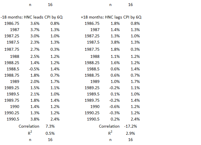
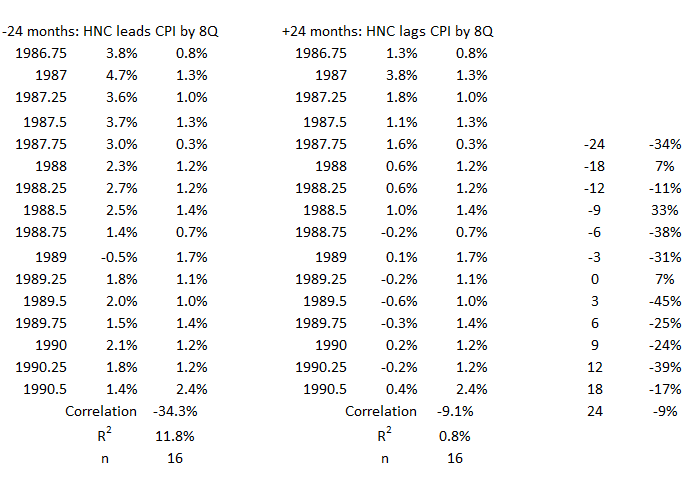
1Q 1987 – 3Q 1990
Figure 19. U.S. HNO Credit and Inflation 1Q 1987 – 3Q 1990
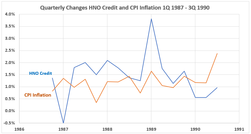
This is an unremarkable graph of a mixture of positive and negative correlation data pairs.
Figure 20. Quarterly Changes in HNO Credit (x) vs. CPI Inflation (y) 1Q 1987 – 3Q 1990
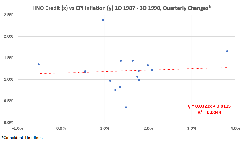
This data set has a nearly uncorrelated pattern for the coincident timelines, R = 7% and R2 = 0.4%.
Figure 21. Correlation Between HNO Credit and CPI Inflation 1Q 1987 – 3Q 1990
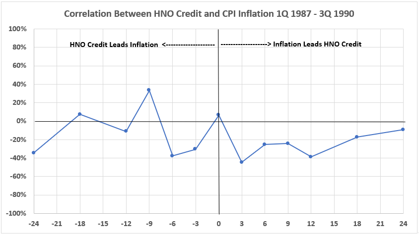
The timeline offsets produce some variations in the correlations. Again, in this inflation surge, CPI Inflation has a negative association (weak here) with future HNO Credit changes.
There is one weak positive association for HNO Creddit nine months ahead of CPI Inflation.
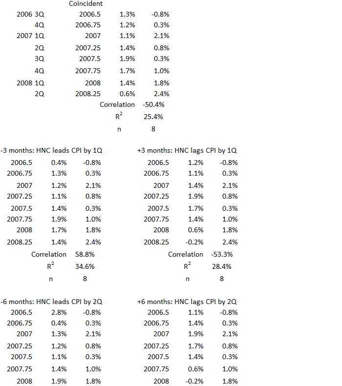
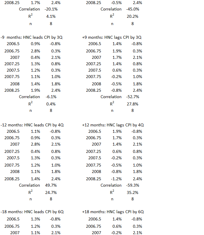
4Q 2006 – 2Q 2008
Figure 22. U.S. HNO Credit and Inflation 4Q 2006 – 2Q 2008
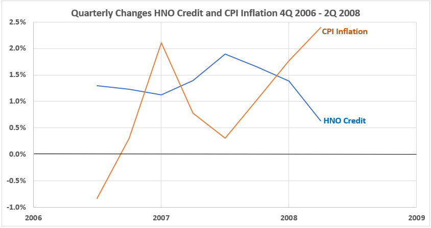
This period covers the end of the housing bubble peak and the start of the stock market decline that was part of the Great Financial Crisis of 2008-09.
Figure 23. Quarterly Changes in HNO Credit (x) vs. CPI Inflation (y) 4Q 2006 – 2Q 2008
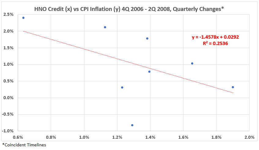
As so often the case in this study, the coincident data sets show a negative correlation. R = –50% and R2 = 25%.
Figure 24. Correlation Between HNO Credit and CPI Inflation 4Q 2006 – 2Q 2008
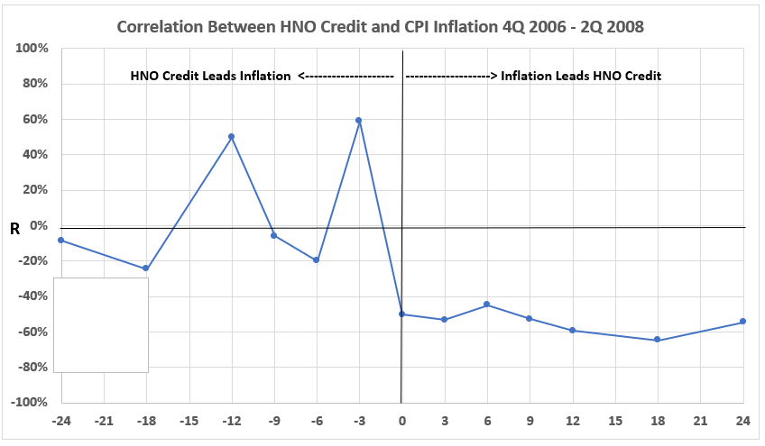
There are too moderate associations for HNO Credit leading CPI Inflation by 3 and 12 months. Otherwise, the correlations are negligible and/or negative.
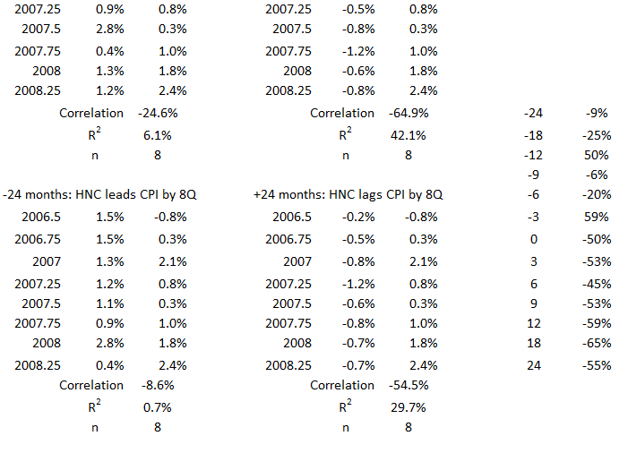
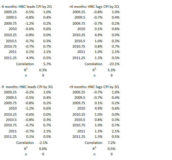
3Q 2009 – 2Q 2011
Figure 25. U.S. HNO Credit and Inflation 3Q 2009 – 2Q 2011
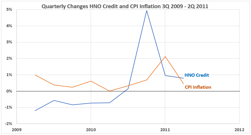
The most notable feature of this plot is the drastic increase in credit spending in 4Q 2010. It might be attributed to pent-up demand after several quarters of shrinking credit spending. One quarter later, there was a bump in inflation.
Figure 26. Quarterly Changes in HNO Credit (x) vs. CPI Inflation (y) 3Q 2009 – 2Q 2011
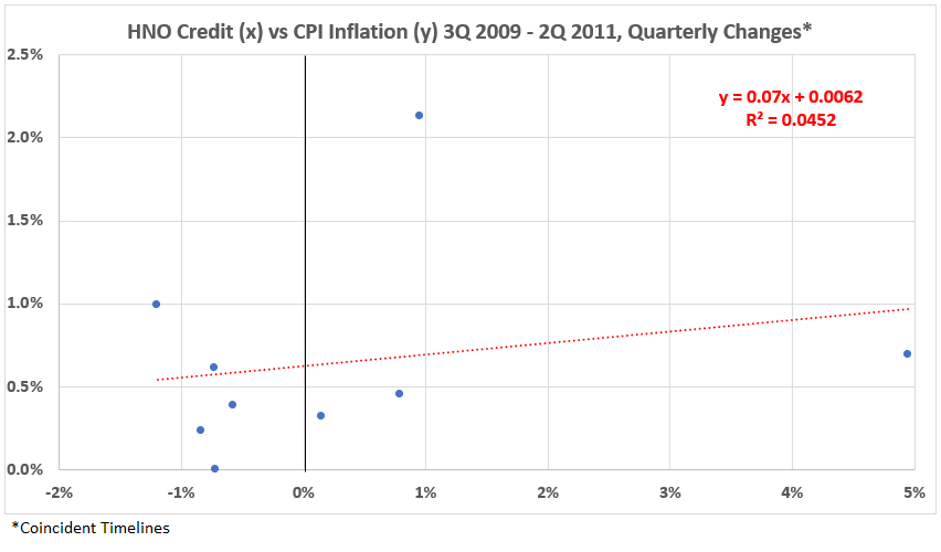
This inflation surge period has a weak positive correlation between consumer credit and inflation. R = 21% and R2 = 5%.
Figure 27. Correlation Between HNO Credit and CPI Inflation 3Q 2009 – 2Q 2011
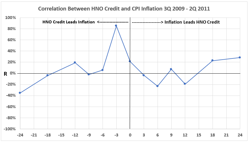
A very strong positive association exists between HNO Credit and CPI Inflation three months later. This relationship is noted in Figure 25.
Also, the appreciable negative association between inflation and consumer credit in the following quarters is not seen during this inflation surge.
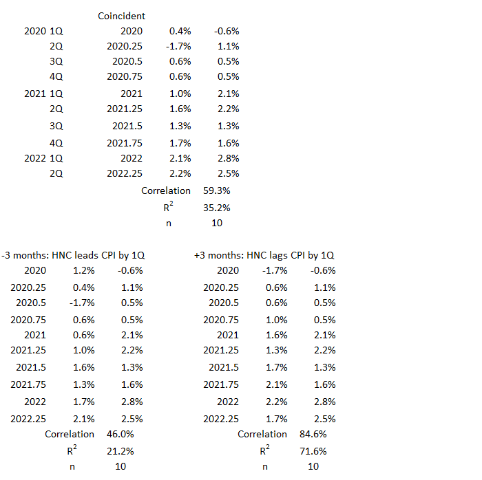
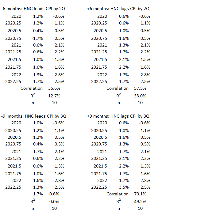
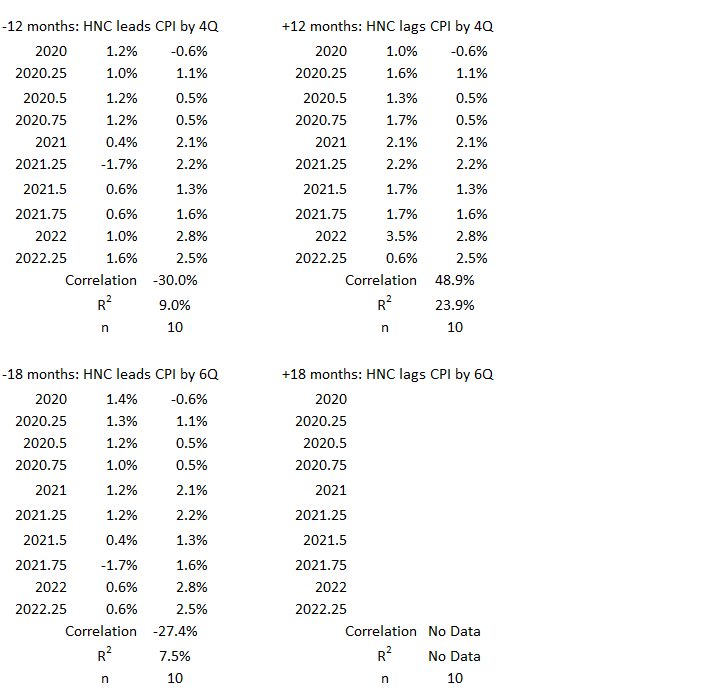
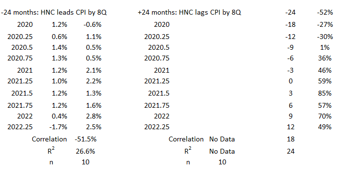
2Q 2020 – 2Q 2022
Figure 28. U.S. HNO Credit and Inflation 2Q 2020 – 2Q 2022
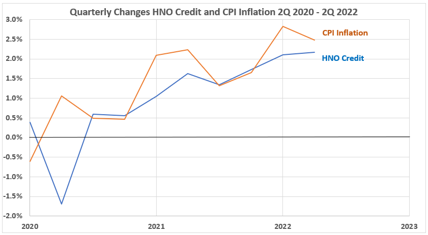
Except for the first two quarters of 2020, when the pandemic took off, and many shutdowns and economic disruptions occurred, CPI Inflation and HNO Credit grew rapidly during this inflation surge.
Figure 29. Quarterly Changes in HNO Credit (x) vs. CPI Inflation (y) 2Q 2020 – 2Q 2022
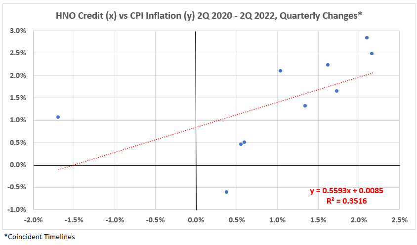
This inflation surge has the largest positive association value for coincident data sets of any of the eight surges since 1950. R = 59% and R2 = 35%.
Figure 30. Correlation Between HNO Credit and CPI Inflation 2Q 2Q 2020 – 2Q 2022
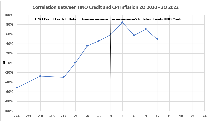
The inflation surge of 2020-2022 is a completely different beast with respect to consumer credit. The other seven surges had mostly negative associations when inflation led consumer credit. There were a few cases where inflation was positively associated with later consumer credit. But there has not been anything like the moderate to strong association of consumer credit in the first four quarters after inflation that is seen here.
Also, there is only a limited possibility that HNO Credit could have caused inflation (left-hand side of the graph). This is another reason the latest inflation surge differed from what preceded it.
Conclusion
There are a variety of association patterns across the eight inflation surges since 1950. This is true for consumer credit as it was for U.S. Federal government deficit spending studied previously.2 One of the reasons for this in the current study could be that consumer credit was a smaller factor in the economy in the post-World War II years. 1960 HNO Credit totaled $58 billion, about 11% of GDP. By 2023, it grew to more than 19% of GDP.
Further conclusions will be discussed after we have the data for the deflationary surges and the periods with more stable inflation for the 1952-2022 period. More results there next week.
Appendix
The data sets for each of the periods of surging inflation are below. They come from the tables of timeline aligments1 (Consumer Credit and Inflation: Part 1).
1Q 1955 – 1Q 1957
2Q 1959 – 4Q 1969
The data for this period is the sum of the next two data sets below (2Q 1959 – 4Q 1964 and 1Q 1965 – 4Q 1969 ).
2Q 1959 – 4Q 1964


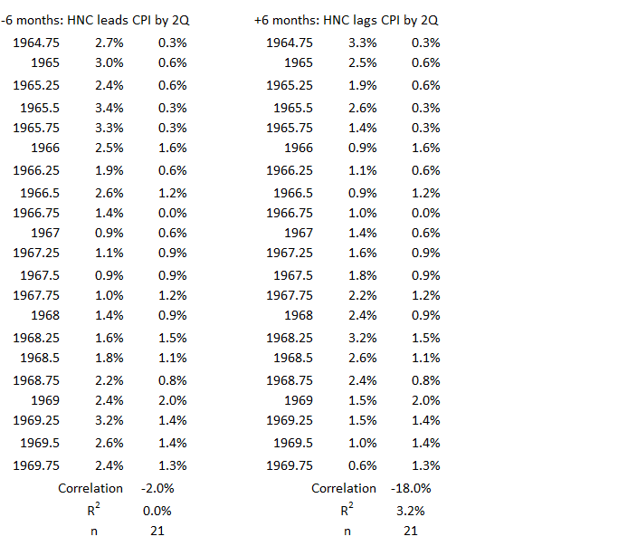
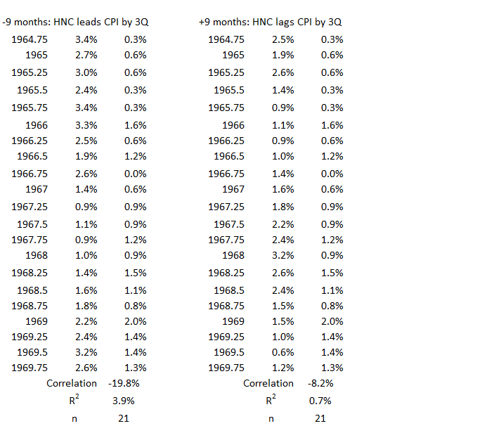
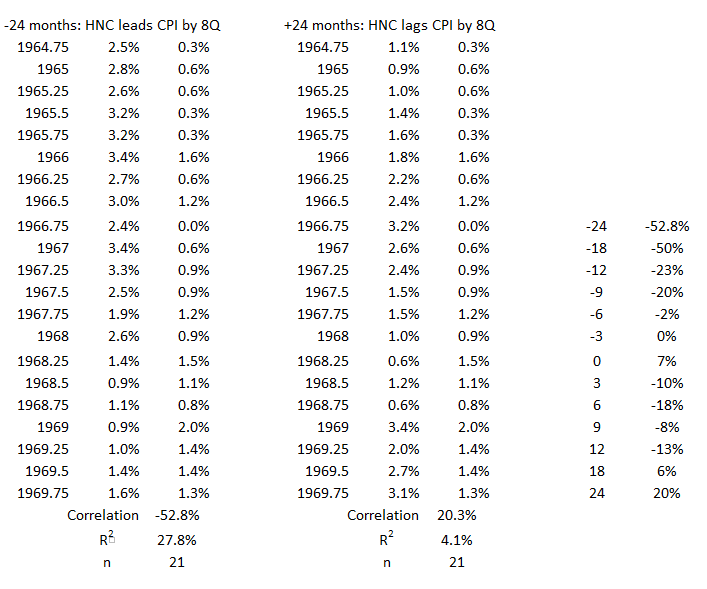
1Q 1965 – 4Q 1969


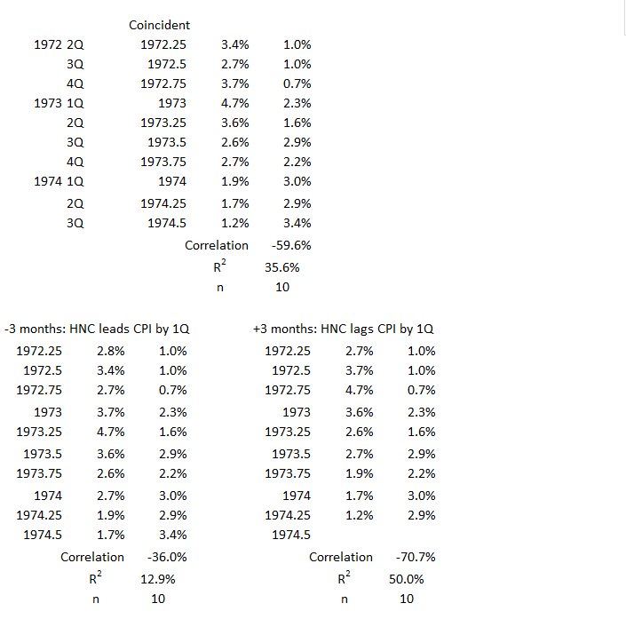
3Q 1972 – 3Q 1974
1Q 1977 – 1Q 1980
1Q 1987 – 3Q 1990
4Q 2006 – 2Q 2008
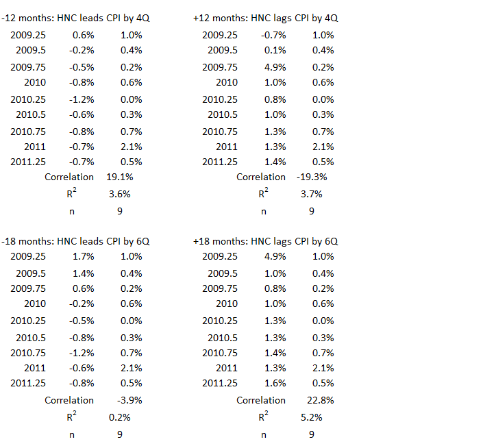
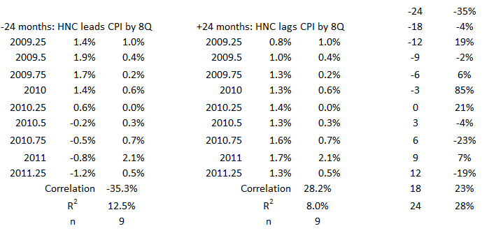
3Q 2009 – 2Q 2011
2Q 2020 – 2Q 2022
Footnotes
1. Lounsbury, John, “Consumer Credit and Inflation: Part 1”, EconCurrents, September 3, 2023. https://econcurrents.com/2023/09/03/consumer-credit-and-inflation-part-1/
2. Lounsbury, John, “Government Spending and Inflation: Reprise and Summary”, EconCurrents, August 20, 2023. https://econcurrents.com/2023/08/20/government-spending-and-inflation-reprise-and-summary/