On the second Thursday of every month, NOAA issues its analysis of the status of ENSO. This includes determining the Alert System Status. The best guess remains March.
But I have actually seen only a few signs of it starting to happen. But all the meteorologists agree that it will. Could they all be wrong? Probably not.
Will this La Nina transition quickly to the El Nino phase? That would be unusual but some of the models suggest this will happen. It seems likely that the ENSO Neutral Phase will at the very least have an El Nino Bias.

| Announcement: We now publish a daily weather report that addresses both near-term through Day 10 U.S. and Global weather issues and an expanded weekend version that looks out 28 days. You can find it at econcurrents.com. To return to this article just hit the return arrow at the upper left corner of your screen |
CLIMATE PREDICTION CENTER ENSO DISCUSSION

| The second paragraph is what is important: “The most recent CPC forecast indicates La Niña will persist into the Northern Hemisphere winter 2022-23, and then transition to ENSO-neutral in February-April 2023.” We interpret February through April to mean March the middle of that three-month period. |
| We now provide a lot of additional detail. The detail is for those who will find it interesting. If your main interest was in learning what the current Status of ENSO was and how long the current state might last, you may not need to read the remainder of this article as that information has already been presented above. If you are interested in how reliable the conclusion is and why one might accept the conclusion or be skeptical about the conclusion, continue to read. |
CPC Probability Distribution
Here are the new forecast probabilities. This information in the past has been released twice a month and the first release is based on a survey of Meteorologists, the second is based on model results. The probabilities are for three-month periods e.g. DJF stands for December/January/February.
Here is the current release
 And here is the forecast from last month

| There is essentially no change. |
Analysis of the current and prior first and second Forecasts in each month.
 And last month
 –
–
| There is a difference between the Mid December and Early January probabilities relative the prospects for El Nino next summer. Remember that the first report issued is based on a survey of meteorologists and the second report is based on computer models. |
Recent ENSO History.

| The three-month average of Nino3.4 readings becomes the Oceanic Niño Index or ONI. So that is an official number subject to change when they update the climatology. What you can see here clearly is the duration of the three phases of ENSO. So we have been in La Nina since JAS 2020. La Nina rarely goes beyond two years. This one looks like it will or has. Hence “Three-peat”. You can access the full history Here https://origin.cpc.ncep.noaa.gov/products/analysis_monitoring/ensostuff/ONI_v5.php ENSO is something like a cycle. Could the length of that cycle be changing? So that is a question that some are thinking about. At first glance, it would seem that La Nina would be rarer rather than more frequent since it is associated with cool water in the Eastern Pacific. But the obvious does not always turn out to be correct. We have now recorded another 3-month ONI that was in La Nina territory. Noticethere was a long string of La Nina ONI’s in 2010 through 2012 but there was one neutral reading that broke the string. We have the same string in 2021 so I guess the stray neutral readings do not count. |
What Does the NOAA Proprietary ENSO Model Forecast?
![]()
| This model suggests a transition to ENSO Neutral in February |
The above does not auto-update but you can click HERE. https://www.cpc.ncep.noaa.gov/products/people/wwang/cfsv2fcst/images3/nino34SeaadjPDFSPRDC.gif NOAA relies more on the CPC/IRI Forecast. If you look carefully for the mean of the various computer runs it intersects -0.5C in JFM 2023. So that is basically saying that La Nina will end during the Winter not after Winter. It is difficult to sort it out as the situation is dynamic and this graphic shows both earlier and recent model runs and it is hard to tell them apart. But it seems to suggest an earlier demise of the La Nina than IRI.
And BOM? (Australian Bureau of Meteorology

| BOM has a different cut-off for La Nina than other meteorological agencies but they see a more rapid end (right now) of this La Nina. Based on their criteria, La Nina will end this month. Also, notice the movement toward El Nino. |
What do Other Meteorological Agencies Say
I do not have the time or resources to check what all of the various meteorological agencies have to say about this. NOAA publishes (or is it IRI) what they call a plume of forecasts from many models not just those operated by the U.S. Last month those models seemed to show that ENSO Neutral with a strong bias towards La Nina was most likely. By a strong bias, I mean the forecast was for Nino 3.4 to be in the lower end of the ENSO neutral range. But the updated version of this “plume” will be published with the second IRI report so I do not have it now. But I do have a report from the Australian Meteorological agency (BOM) which shows a subset of models.
Australian BOM

–
| What I am showing here are NINO 3.4 forecasts for March of 2023. These are well-respected models. And using the U.S. threshold of -0.5 C they all show that we will be in ENSO Neutral. Here is the link for this report and other ENSO information from BOM. They mostly show we will be out of La Nina by February. |
But let us look out a little farther

–
| By June the models ae edging towards El Nino and using the U.S. criteria many models are predicting El Nino by June. At any rate the predictions are calling for ENSO Neutral with an El Nino Bias. |
And JAMSTEC

–
| JAMSTEC is all in for a rapid change to a significant El Nino. We will provide the JAMSTEC Two-Season forecast soon |
Looking at Actual Current Conditions.
NOAA reports some derived data that describes the current situation and a forecast. But what if we want to form our own opinion? After all, meteorologists are looking at the actual current situation and making predictions.
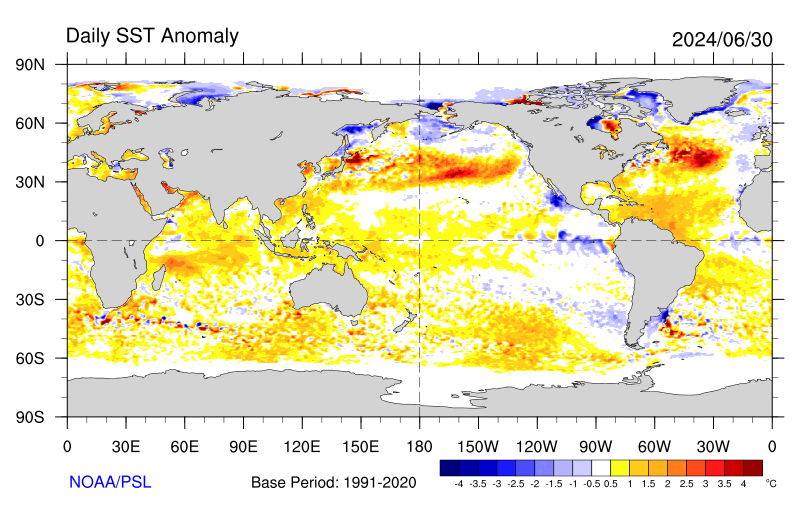
This shows the current actual situation for the surface of oceans.

| Notice the cool water is almost all south of the Equator but the pattern extends to the west more than usual. To update this graphic click https://psl.noaa.gov/map/images /sst/sst.daily.anom.gif Looking further north, It still looks like PDO NEG with the warm water way out to sea. |
I have been showing the BOM forecasts of SSTA but this month I am showing the NOAA forecast which can be found HERE.

|
_
Putting the historical information in motion (Updates can be found HERE.)
 Where is ENSO Measured?


–
You can mentally superimpose the Nino 3.4 area shown encompassing part of the yellow and part of the red areas in the above map and you can see that it is cool in the Nino 3.4 area especially South of the Equator. That is an oddity of this La Nina that is both westerly displaced and focused mostly south of the Equator. There is not much discussion of that and how that might impact our weather. It certainly explains why the NINO 3.4 Index is still in La Nina territory but warmer than last month.
Mapping the details. (Cross-Section along the Equator)
The data is a five-day average centered on the date shown.

And last month
And the month before.
 And the month before that.
And the Month before that.

| All I see is a lot of cold water (what is shown is anomalies compared to climatology for location and time of year. I am not showing more than one of the prior versions this time. But the above is clearly la Nina and the warm IndoPacific Warm Pool shows no indication of moving east to replace the cool water that defines a La Nina. The cool anomaly is mainly south of the Equator (can not see that in the above graphic) and it extends far to the west (which you can see) making it what the Japanese call a Modoki. So I do not see the change. |
–
This might be a better way to look at it.

| This set of graphics seems to show it better. It covers a shorter period of time but the temperature scale is a little different. |
–
Another way to look at the same information

| Here there is a clear indication that the Eastern Pacific is warming. In the above, the anomalies from the surface down to 300 meters are added together. It now shows a significant warming trend. |
Are the changes significant? We need to look at additional information.
Another way of looking at the situation is the impact of the Oceanic Kelvin Waves.
What is below explains a lot.
We described Oceanic Kelvin Waves in the article some months ago but let’s just say they are near-surface waves confined to the Equator which can move warm water east and help end a La Nina. The downwelling phase of such a wave is shown in red and the upwelling phase is shown in blue. The recent Kelvin Wave made it look more likely that we would transfer to ENSO Neutral. But it turned out to be a fairly weak Kelvin Wave not followed by another one although we might see one forming in this graphic. We might but we do not.
| The onset and evolution of the recent Kelvin Wave explain most of the changes in the probabilities from one release to the next so I think the Meteorologists may not have been paying as careful attention to this as they might have. You have to look at the Hovmoller carefully since it is showing things over time. The dates are shown. And we are mostly interested in what is currently taking place between 170W and 120W and what we can expect to happen as the waves progress to the east. There are no signs yet of another Kelvin Wave. But the current Kelvin Wave is playing out. |

Looking at the Wind Anomalies. This is another way to try to understand what is happening and this is another Hovmoller chart. I am pretty sure they used to create these charts with a plotter and every day the roll would unwind and there was one more day’s worth of data added. The format remains and it still works pretty well.

| This is a Hovmoller graphic. It is sort of what comes off of a plotter so the most recent information is at the bottom and the earlier information is at the top. Easterlies tend to be associated with La NIna since the Warm water in the IndoPacific Warm Pool can not easily move east. There is NOW A SIGN OF THE Easterlies weakening. But is the graphic artist playing games with us? |

| The SOI has been falling which is a third argument in favor of the end of La Nina being possible but the SOI fluctuates a lot. |
| My conclusion is the models probably have it right. They have done a better job than I have at figuring this out. But were they mostly basing their forecasts on statistics? Maybe I will come across a professional paper that reviews how the models have come to the conclusions that they have. |
From the NOAA ENSO Blog a Post by Emily Becker

You can read her blog post tonight HERE
What about the Indian Ocean Dipole (IOD)?
| The index is calculated as the monthly difference between the western (10°S-10°N, 50°-70°E) (WTIO) and eastern Indian Ocean (10°S-0°, 90°-108°E) (SETIO) sea surface temperature departures from average. |

–
Australia BOM IOD forecast

–
| The IOD seems to be over so I am not going to provide a discussion of the impacts of a negative or positive IOD. It may reoccur this summer. |
| I hope you found this article interesting and useful. |