New Experimental Forecast Addresses the Impact of Global Warming on Marine Heat Waves – July 17, 2023
 This is a somewhat confusing post that appeared in the NOAA Climate Blog which is intended to be informative and also announce a new NOAA website which you can access HERE. But we already know that the oceans are getting warmer due to Global warming. Oceans are three-dimensional. Are surface temperatures important other than the impact on the atmosphere? It is a new website but I think they have publicized it prematurely as it is IMO not fully developed. But it is a good start. They have a long way to go. But the topic is very important.
Here is the definition of a Marine Heat Wave:
“The marine heatwave (MHW) in the forecast is identified when sea surface temperature anomaly (with respect to the 1991-2020 monthly climatology) is above the MHW threshold. MHW thresholds specific to each month of the year are calculated as the 90th percentile of SST anomalies in a 3-month window (for example, for January MHWs, the 90th percentile of all December to February SST anomalies).” [Editor’s note: why 90%? That seems pretty arbitrary to me but it may be appropriate. I did not address the issue of
That is reasonable enough. In the blog article, they show the forecast for September and what it would be if we did not have Global Warming. But the counterfactual only compares the forecast to thirty or so years ago so it is a stretch to call this with and without Global Warming. But it does call attention to the problem of oceans that are warming.

First, we take a look at the current situation:
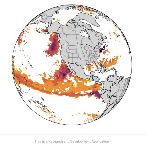
| Not sure why they use a different color scheme. Not sure why they do not show the World. And we are in El Nino. |
Then the with and without Global Warming for September of this year.
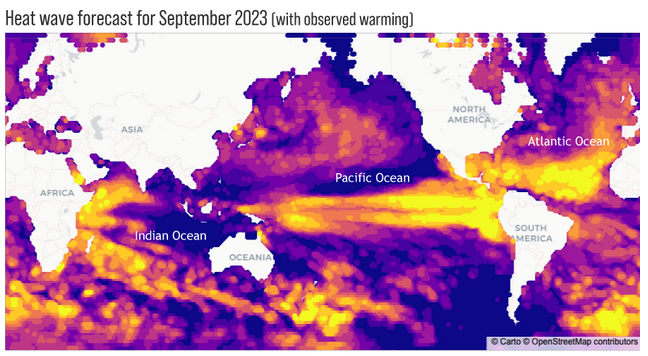
| The yellow and orange colors show what NOAA calls Marine Heat Waves. Of interest is the Atlantic Ocean which would be a major hurricane maker if not for the El Nino which blows the tops off of developing hurricanes. We expect to see the El Nino warm tongue off of Peru during an El Nino. But there are a lot of other areas that are yellow and orange but some of that is the IOD. I do not like the color coding that was used. I find the graphic confusing. I will get used to it. BTW it shows PDO Negative, unfortunately. |
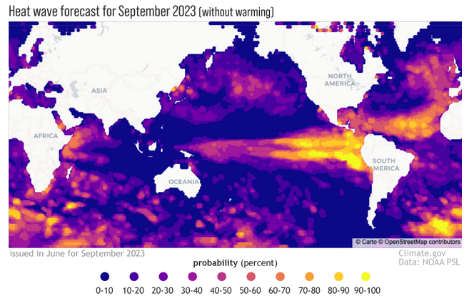
| This is quite different and makes the point. But oceans are 3D and I prefer the way JAMSTEC handles it with layers of the ocean. NOAA probably does that as well but so far they have not figured out how to display it. And of course, 3D is difficult to display. I think they should show the legend with both graphics. |