Ten Years of ENSO Blog – Ten Important Graphics – Published on May 27, 2024

The Climate.Gov ENSO recently was 10 years old and they have been celebrating and Tom Di Liberto produced an article that consisted of 10 graphics that he thought important and I have just reproduced that article here without comment. Memorial Day is a somber day but it is also a time to reflect and I thought that some would find this to be of interest.

It’s hard to believe that ten years ago a ragtag group of El Niño-Southern Oscillation (ENSO) scientists teamed up with an impossibly patient and wise editor and data visualization team at Climate.gov to start this blog. And it’s even harder to fathom how popular the ENSO Blog has become; we’ve had 6.6 million lifetime page views and nearly half a million readers in the past year alone. So, thank you to all of our readers who have stuck with us as we delved into some amazingly complex and nerdy topics (and some amazingly awful puns) over the years.And what better way to celebrate ten years than to shamelessly steal a time-honored tradition in the TV sitcom world, the clip show! But instead of clips, please find a ranking of the best—most creative, most memorable, most useful—graphics that have appeared on the blog. Did your favorite not make the cut? Let us know in the comment section what we missed and why you love that image so much.

Without further ado, here’s a 100% “objective” list of the top ten ENSO Blog graphics.

Most will need to click on “Read More” to access the body of this article.

Is ENSO Static? Are they all Alike? Is there a Trend? – Posted on April 3, 2024

There was a very interesting blog post on ENSO.Gov that tries to assess this El Nino in the context of other El Ninos and I think they have done a very good job. I have reproduced the blog post in this article. Those who want access to any comments that have been submitted to that blog post can find the post HERE. Remember that all posts on the Climate.Gov ENSO Blog are attributed to the author who in this case is Nat Johnson. All the ENSO Blog posts are excellent. This one is beyond excellent.

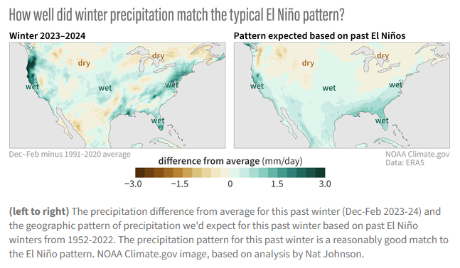
The above shows that the current El Nino which is winding down has been pretty close to what would be expected from a typical El Nino. It also shows how both the typical El Nino and the current El Nino compare to Normal or Climatology. You can easily see the differences. The analysis is for the Meteorological Winter months of December through February.

There is a lot more to this blog Post so some readers will need to click on “Read More” to access the rest of this very interesting analysis.  If you accessed this article via the url you will already have the full article and will not need to click on “Read More”.

ENSO Blog: “How does El Niño influence winter precipitation over the United States?” December 5, 2023

You can read this post on the ENSO Blog HERE but you might find it convenient to read it here.

It is a great article and very worthwhile reading.

I have not added any comments to it in the body of this article. Any comments I have are here in the lede.

A. I question some of the graphics. re the La Nina part of the graphic since -1 is not stronger than -2

B. I was shocked at how poor the performance of the models is.  I think how much of a coat our animals grow may be a better predictor.

It is an excellent article, you should read it.

Perhaps I should publish my analysis tool which I used to do. But I would have to update it and that is a lot like work. I think I have the information to do the analysis now

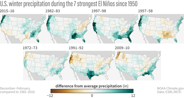
Maps of U.S. precipitation

Please click below to read the full article and the comments to the article that show up as footnotes.