The Climate.Gov ENSO recently was 10 years old and they have been celebrating and Tom Di Liberto produced an article that consisted of 10 graphics that he thought important and I have just reproduced that article here without comment. Memorial Day is a somber day but it is also a time to reflect and I thought that some would find this to be of interest.

It’s hard to believe that ten years ago a ragtag group of El Niño-Southern Oscillation (ENSO) scientists teamed up with an impossibly patient and wise editor and data visualization team at Climate.gov to start this blog. And it’s even harder to fathom how popular the ENSO Blog has become; we’ve had 6.6 million lifetime page views and nearly half a million readers in the past year alone. So, thank you to all of our readers who have stuck with us as we delved into some amazingly complex and nerdy topics (and some amazingly awful puns) over the years.And what better way to celebrate ten years than to shamelessly steal a time-honored tradition in the TV sitcom world, the clip show! But instead of clips, please find a ranking of the best—most creative, most memorable, most useful—graphics that have appeared on the blog. Did your favorite not make the cut? Let us know in the comment section what we missed and why you love that image so much.
Without further ado, here’s a 100% “objective” list of the top ten ENSO Blog graphics.
Most will need to click on “Read More” to access the body of this article.
#1 Kelvin wave shark
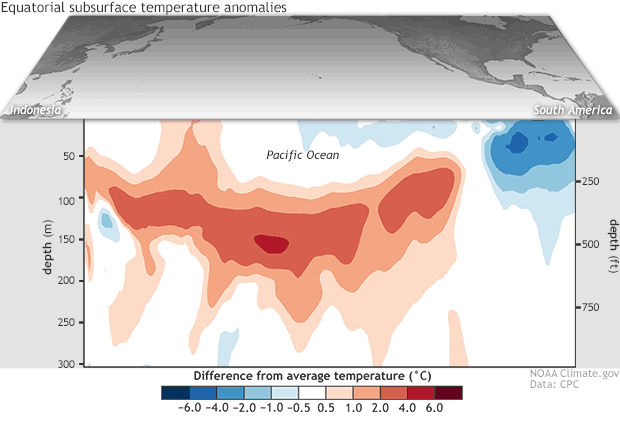
Departure from average of the surface and subsurface tropical Pacific sea temperature averaged over the 5-day period centered on 3 April 2018. The vertical axis is depth below the surface (meters) and the horizontal axis is longitude, from the western to eastern tropical Pacific. This cross-section is right along the equator. Climate.gov figure from CPC data.
Back in April 2018, Emily noticed that the above-average ocean temperature anomalies at depth across the Pacific bore a striking resemblance to a shark ready to take a bit out of the colder-than-average ocean temperatures in the eastern Pacific. Once you see it, you can never un-see it.
#2 The Blob and El Niño go for a stroll
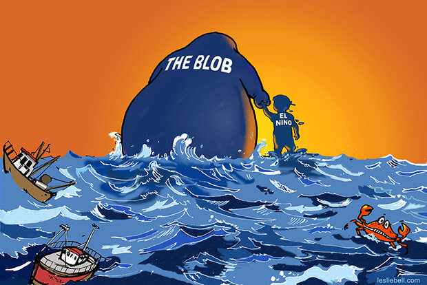
The Blob has severe ecological and economic consequences. Credit: Leslie Bell
This image drawn by Leslie Bell, the mom of one of our guest bloggers, Michael Jacox, is my favorite cartoon. In the science world, we often use words that might mean one thing to us but something completely different to others. This cartoon leans right into that melding of both worlds. Read the post.
#3 It’s not a cold, it’s…
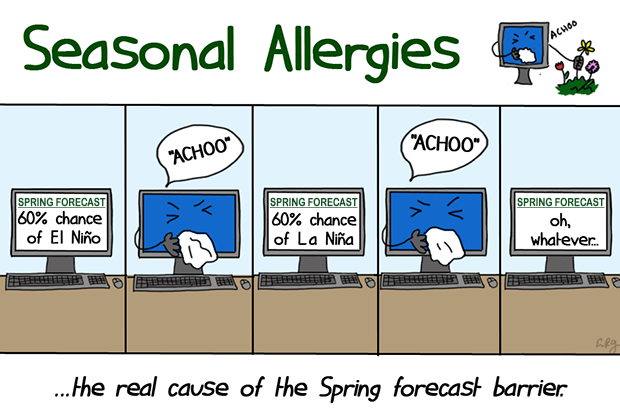
Illustration by Emily Greenhalgh, NOAA Climate.gov.
What better way to show ENSO’s infamous spring predictability barrier than with a cartoon of a computer getting the sniffles. When it comes to forecasting ENSO, springtime is the worst time to make forecasts. The models we use have a lull in accuracy which has come to be known as the spring predictability barrier. I’m not saying that our models have a case of spring allergies, but I’m not not saying that.
#4 Atmospheric highways
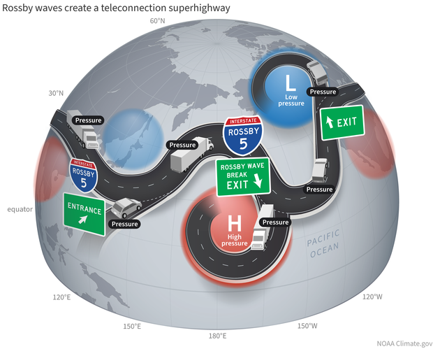
When the jet stream interacts with an atmospheric Rossby wave, it develops crests and troughs that create alternating high (red) and low (blue) pressure zones in the upper atmosphere. These connected climate patterns—teleconnections—travel along the jet stream like vehicles on a globe-spanning highway. NOAA Climate.gov image.
Like life, the way that El Niño and La Niña affect the mid-latitudes via teleconnections is like a highway. In this case, the atmospheric highway known as the jet stream. Our guest bloggers, Breanna Zavadoff and Marybeth Arcodia, conceived of a cartoon that breaks it all down for you. No need to call AAA.
#5 Are we there yet?
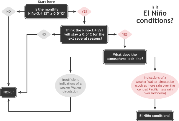
Summary of NOAA decision process in determining El Niño conditions. NOAA Climate.gov drawing by Glen Becker and Fiona Martin.
No one has written more ENSO Blog posts than our lead writer Emily Becker. And no one has had to find new and innovative ways to talk about the latest ENSO forecast than she. One stroke of genius was the development of this flow chart to answer the question we get asked the most “Are we in El Niño yet?” In yet another family effort, her spouse, Glen Becker, helped dream up this schematic.
#6 Snow during El Niño
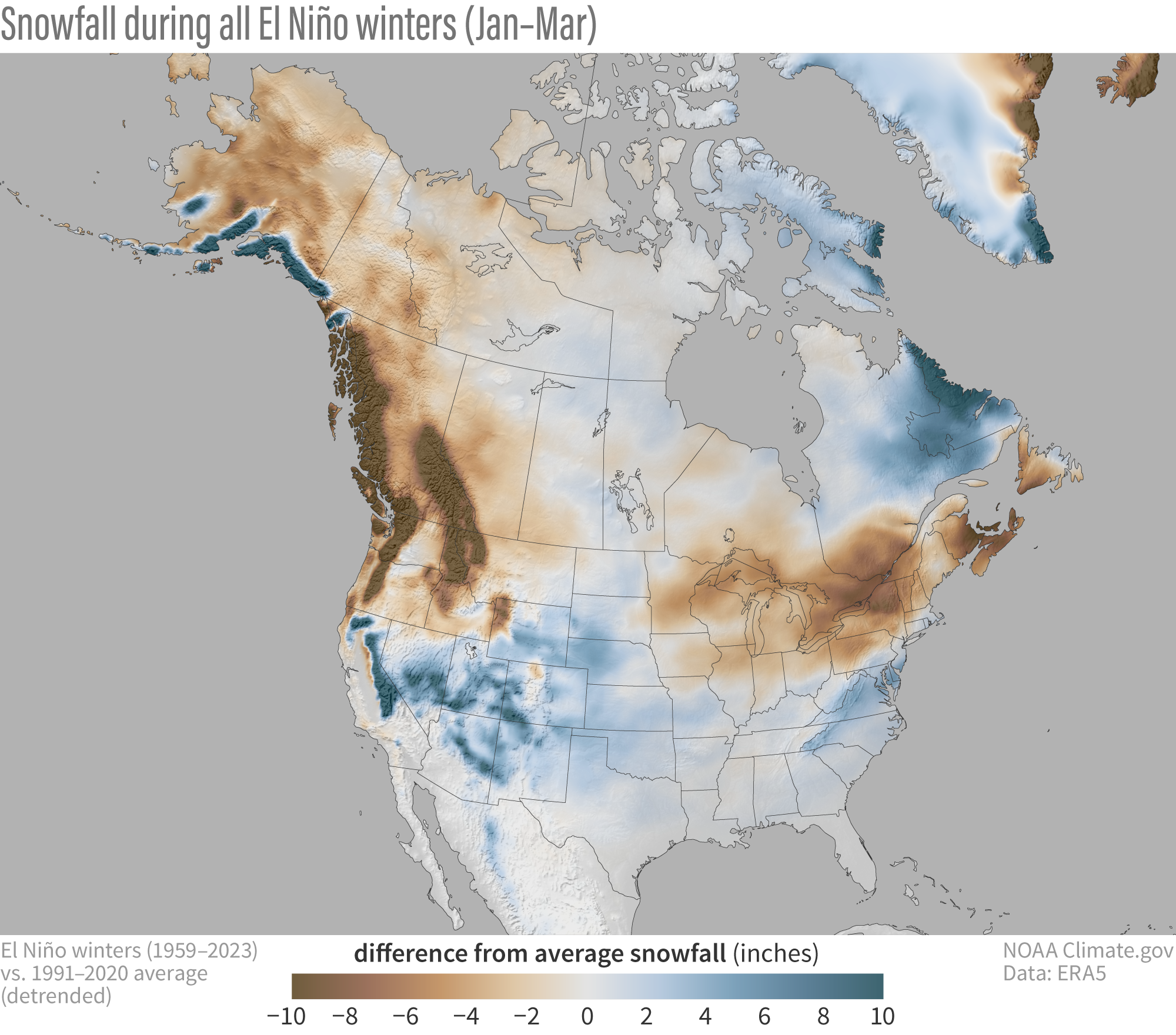
Snowfall during all El Niño winters (January-March) compared to the 1991-2020 average (after the long-term trend has been removed). Blue colors show more snow than average; brown shows less snow than average. NOAA Climate.gov map, based on ERA5 data from 1959-2023 analyzed by Michelle L’Heureux.
It should not be surprising that since El Niño and La Niña peak in strength and impact over North America in winter that a lot of folks wonder what that means for snow. In this ENSO Blog favorite, we’ve got you (snow)covered. (I warned you about bad puns.)
#7 In-ocean obs over time
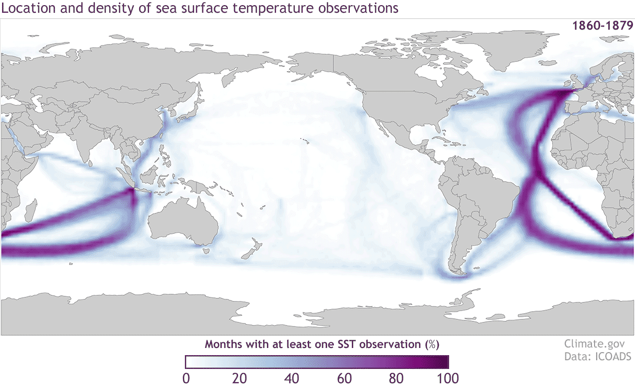
Locations of sea surface temperature observations from the International Comprehensive Ocean Atmosphere Data Set (ICOADS) for 20-year periods starting with the 1860-1879 period and ending with 1980-1999. The colors represent the percentage of months with at least one sea surface temperature measurement in each 2 degree by 2 degree grid box. The darker the color the higher the percentage of months in each 20-year period that has an observation. NOAA Climate.gov image with data from ICOADS.
I love observations. So much so that I wrote a love letter to the TAO Buoy Array. That post also contains one of my favorite displays of data in the ten years of this blog: the evolution of sea surface temperature observation locations from the 1800s to today. The ocean is a big place, and for a long time, we weren’t measuring a lot of it.
#8 Salmon spaghetti
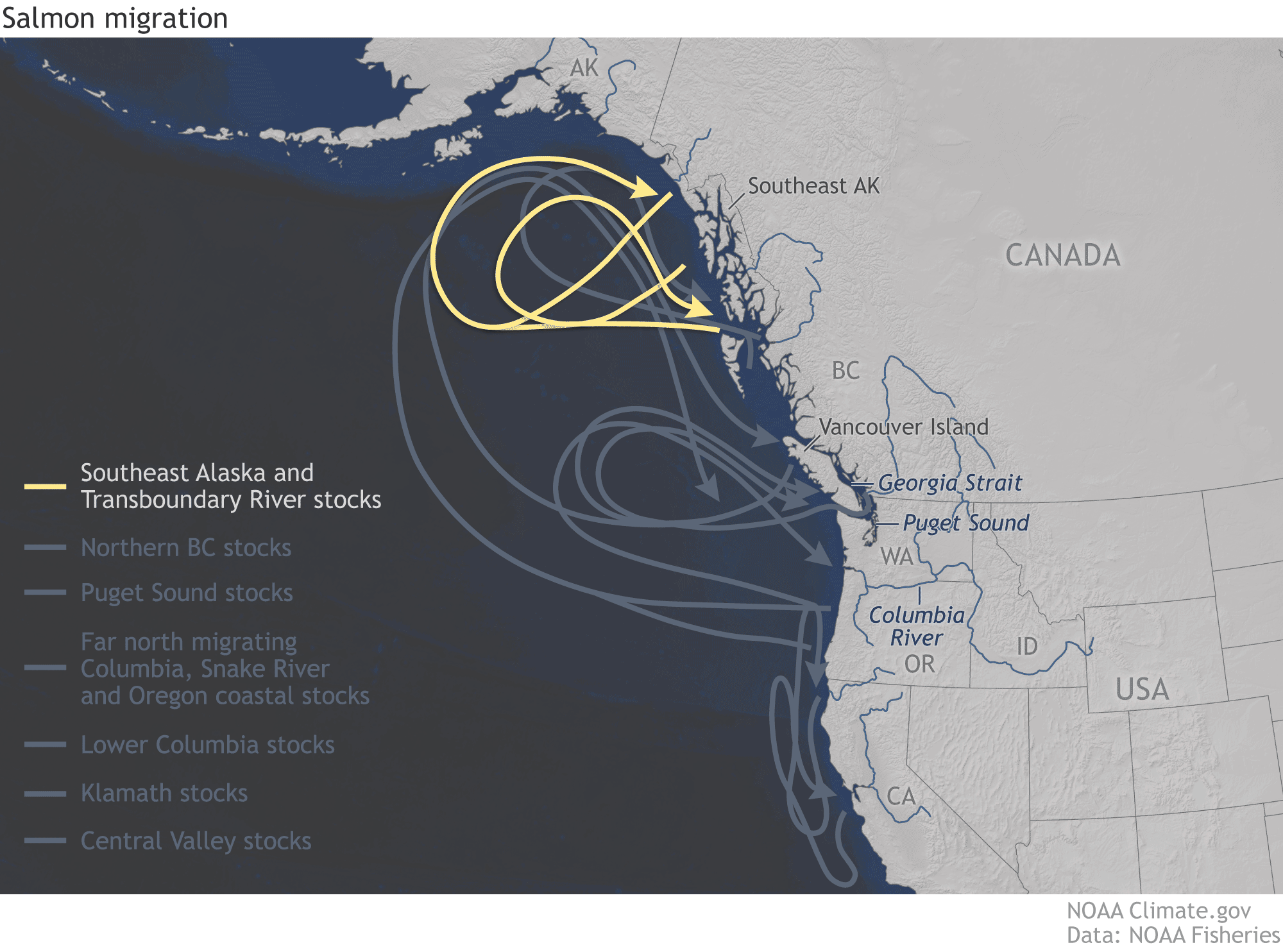
Different migratory patterns of specific populations of salmon across the West Coast from California to Alaska. NOAA Climate.gov image adapted from NOAA Fisheries data.
The best part of the ENSO blog to me is getting a chance to highlight all of the ways that El Niño and La Niña affect our planet, and getting a chance to learn something new. Your faithful ENSO Bloggers are not marine biologists by any means but we know a bunch of them. One such conversation led to this graphic of how different stocks of salmon migrate along the West Coast. Who knew? Not me! I’m a landlubber.
#9 Walker Circulation
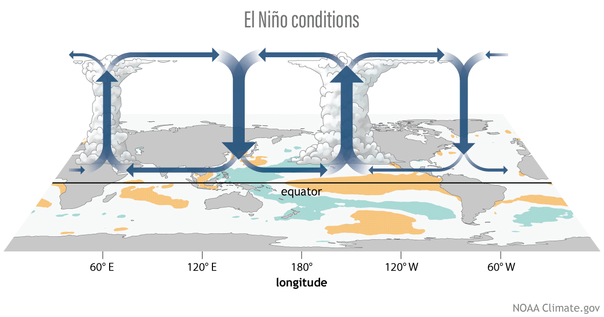
One of the most widely requested and re-used ENSO Blog graphics is this one showing the atmospheric part of ENSO: the Walker Circulation. This animation shows how the areas of convection (rising air) and subsidence (sinking air) change strength and location as sea surface temperatures change during El Niño and La Niña. NOAA Climate.gov graphic.
If you asked me before the start of the ENSO Blog what was the #1 graphic I would want to remake, it would be the depiction of the Walker Circulation, the atmospheric circulation across the tropics. And thanks to the amazing data visualization team at Climate.gov, my dream was realized. These schematics have been used countless times in ENSO Blog posts but also in news articles and textbooks. So pretty.
# 10 But what does it mean for me?
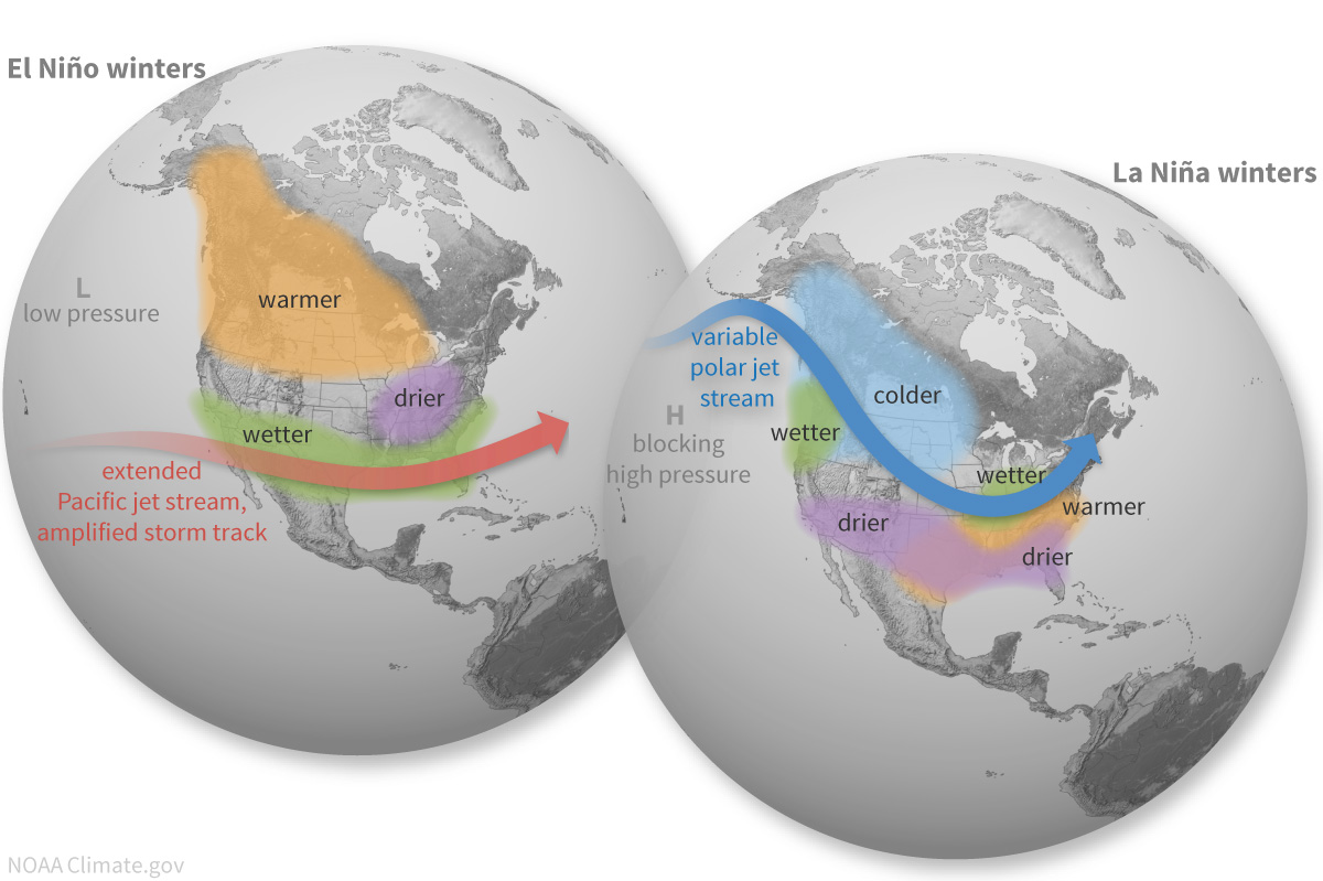
I’ve saved the best for last, the graphics depicting how El Niño and La Niña impact the U.S. As ENSO scientists, we know how much people in the U.S. wonder what El Niño and La Niña might mean for them. Believe me, we’ve read the comments.
Honorable Mention
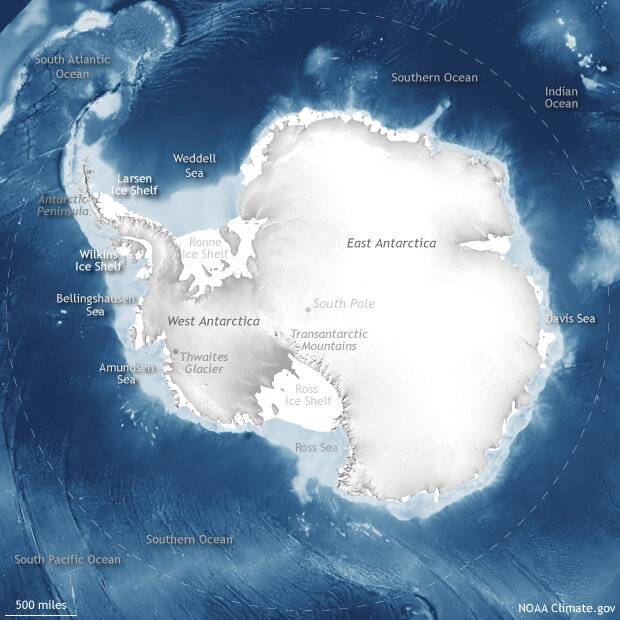
Geographers divide Antarctica into three regions: East Antarctica, West Antarctica, and the Antarctic Peninsula. The Transantarctic Mountains separate the eastern and western parts of the continent. Ice shelves fringe the continent, the two largest being the Ronne and the Ross. Among the nearby seas are the Amundsen, Bellinghausen, Davis, Ross, and Weddell, and Antarctica is surrounded by the vast Southern Ocean.
I love geography and maps. And this map of Antarctica from a post about one of ENSO’s most far-flung teleconnection is simply too beautiful to not include in this list.
–
| I hope you found this article interesting and useful. |