
Once a month USDA issues two reports on World Agriculture Production. Saturday I published the summary of the World Agriculture Supply and Demand (WASDE) situation. My article on this can be accessed HERE. The USDA report on supply and demand includes information on production but does not provide as much information on production as this report but the production information in this USDA Report is is taken from the USDA report on Supply and Demand. Production is part of Supply because Supply is current Production plus changes in inventory. It is confusing with two parts of USDA publishing information on the same topic but you need to look at both reports to get the complete picture.
Production is useful when we are looking at trends. That information is provided in this USDA Report and I am providing the part of the report that contains maps and text.The second part of the report contains detailed tables covering a large number of nations and crops. At the end of the article I provide the link to the full report. I think that each month USDA focuses on certain countries and crops. If they did that each month their report would be way too large and they probably do not have the staff to create that kind of report each month.
Remember: The U.S. is part of the World so reports about World Production also contain information on U.S. Production. All of these reports are complicated by the time of the year the report is produced. The stage of production varies a lot from the Northern Hemisphere to the Southern Hemisphere and also by crop and species of animal. I have reorganized the report a bit to keep all the information for the same country together and to start with the EU as I thought that would be of most interest to readers.
There is also a U.S. version of this report but there are only so many hours in the day for me to write and readers to read my articles.
The Production report is useful for understanding of:
A. How it might be impacted by Global Warming and
B. The impact on the World Geo-political situation.
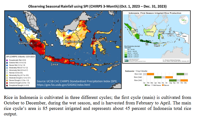
C. The impact of ENSO. For the U.S. El Nino tends to be wet. For much of the World, El Nino tends to be dry. So we see both impacts in what I will now present.
Let’s get started. Where I have comments the are provided in a box so that you can tell that is from USDA and what are my mostly explanatory comments. At the end of the article there is a conversion table from metric to English Units e.g. hectares versus acres.
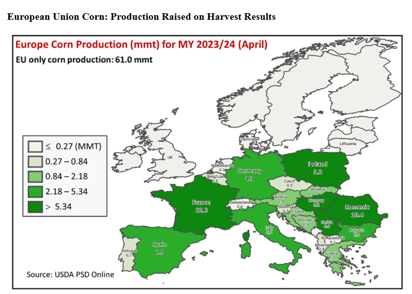
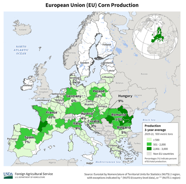
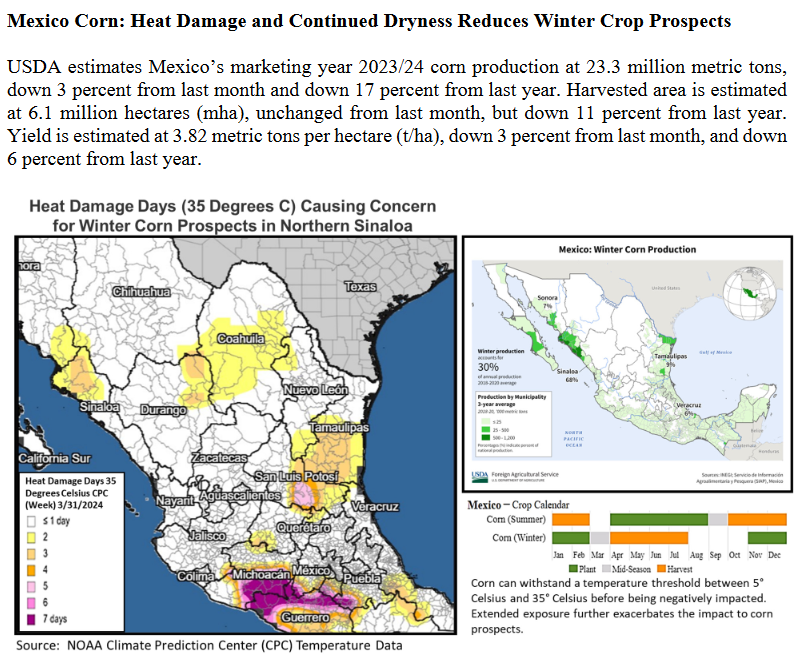
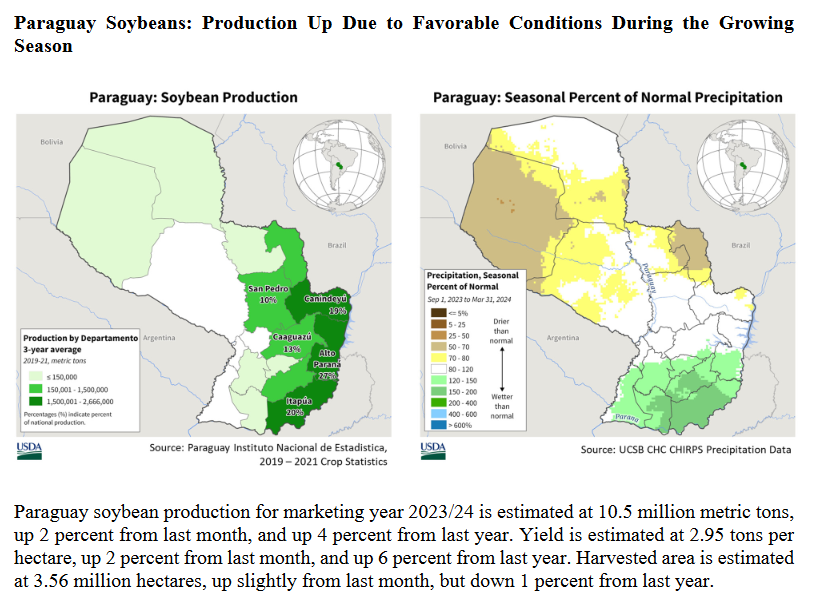
| It is easy to get confused with what is being presented in the above graphics. In some cases they are talking about yield. In other cases the number of Hectares planted. I think the abbreviation MY means market year which varies by crop and location. Also the maps show the EU so they do not include the UK or Ukraine. |
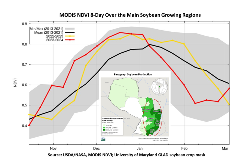
| NDVI (Normalized Difference Vegetation Index) is used to quantify vegetation greenness and is useful in understanding vegetation density and assessing changes in plant health. NDVI is calculated as a ratio between the red (R) and near infrared (NIR) values in traditional fashion: (NIR – R) / (NIR + R). The NDVI does not show the cause of something but the result of something. One can surmise that it was wet in Nov – Dec which was good for plant growth and then dry through to March. I am not exactly sure why USDA included that graphic but it is a common measure so I thought I would explain it. |
Some will have to click on “Read More” to access the remainder of this article. There is a lot more.
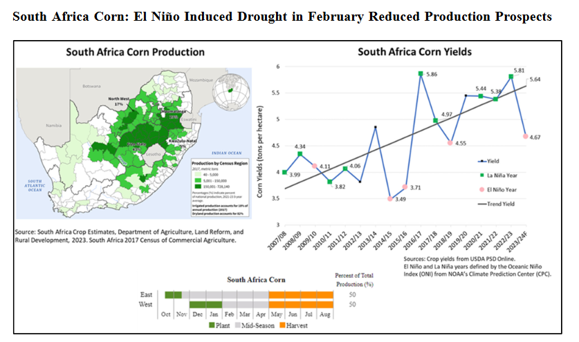
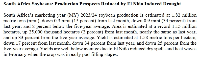
| An upward trend with El Nino years being drought/down years. |
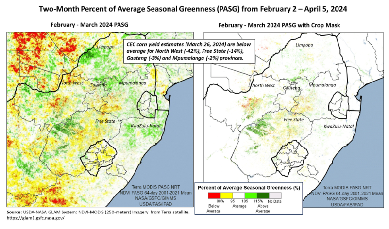
| Not sure I understand these graphics. I think the left shows greenness whether it be the crop on anything else and the right isolates the crop. You get pretty much the same answer either way. The Northwest was the hardest hit. |
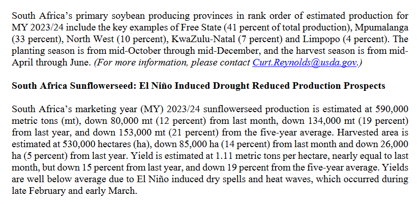
| Same story. Upward trend with most down years being El Nino years. |
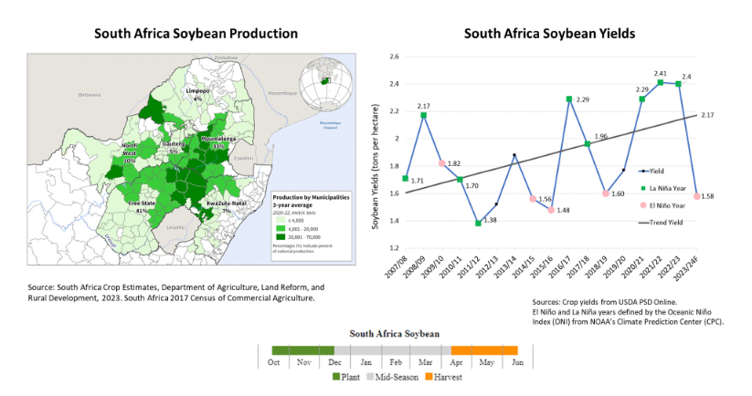
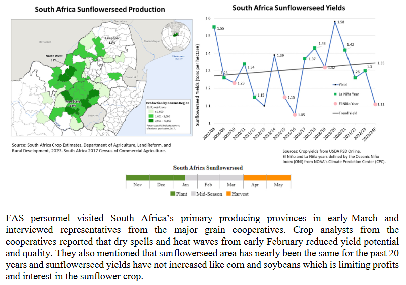
| The graph shows the areas planted in soybeans and sunflowers and the text tries to explain the reasoning of the farmers. Farmers are smart. |
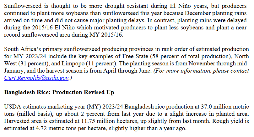
| An interesting discussion. But what about prices? |
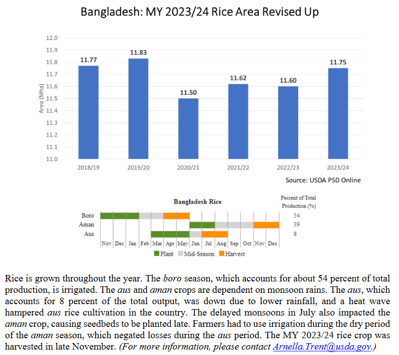
| I have not researched, but the IOD is a factor here also and the positive IOD may have canceled out the El Nino impacts for Bangladesh. |
–
| It is a little hard to read this graphic. |
–
| Neat chart showing the El Nino precipitation was the lowest in the six year period |
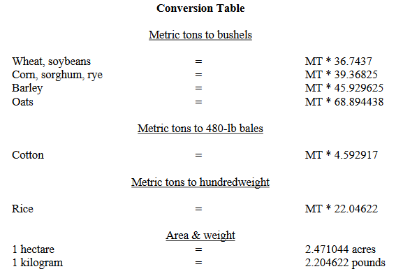
| It is always handy to have a Metric units to English/Imperial units conversion table |
The full report which includes the detailed country by country tables can be accessed HERE.
–
| I hope you found this article interesting and useful. |
–