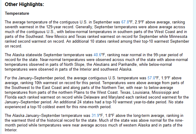
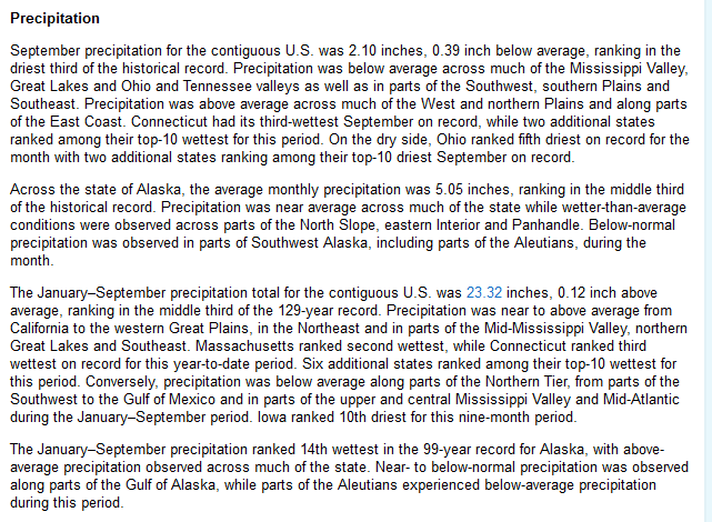
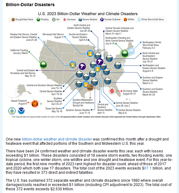
Most of the information in this report comes from the monthly email I receive from John Bateman. He does public outreach for NOAA and in particular NCEI. I could find the same information and more on the NCEI website but John produces a good summary so I use it or most of it. I also sometimes add additional information from NCEI or other NOAA websites. John Bateman sends me two emails. One on the World situation and one for the U.S.
This article is about September 2023 in the U.S.
One of the things I like to add to what John Bateman sends me is the state ranking maps. These maps show how temperature and precipitation for each state rank relative to the 129 years of what is considered to be the most reliable data we have. When I was working on this article Friday night the NOAA website for the state ranking was not working correctly and I thought I would not be able to include the state rankings but I was able to fiddle with the url and get it to provide me with the images I wanted. Sometimes the weekly USDA crop bulletin also includes those images. At any rate, I was able to include those images in the article so I think readers may find it interesting.

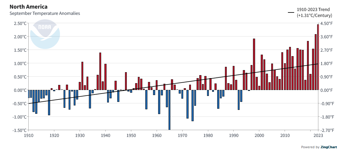
| This is the North America Temperature trend not specific to the U.S. but this is what I was able to find. You do see that September was a big increase over the trend, there is a regression line in this graphic. The slope is 1.31C per century. That is quite a bit. For comparison, I am showing below the Global Trend. The full report on Global September Weather can be accessed HERE. |
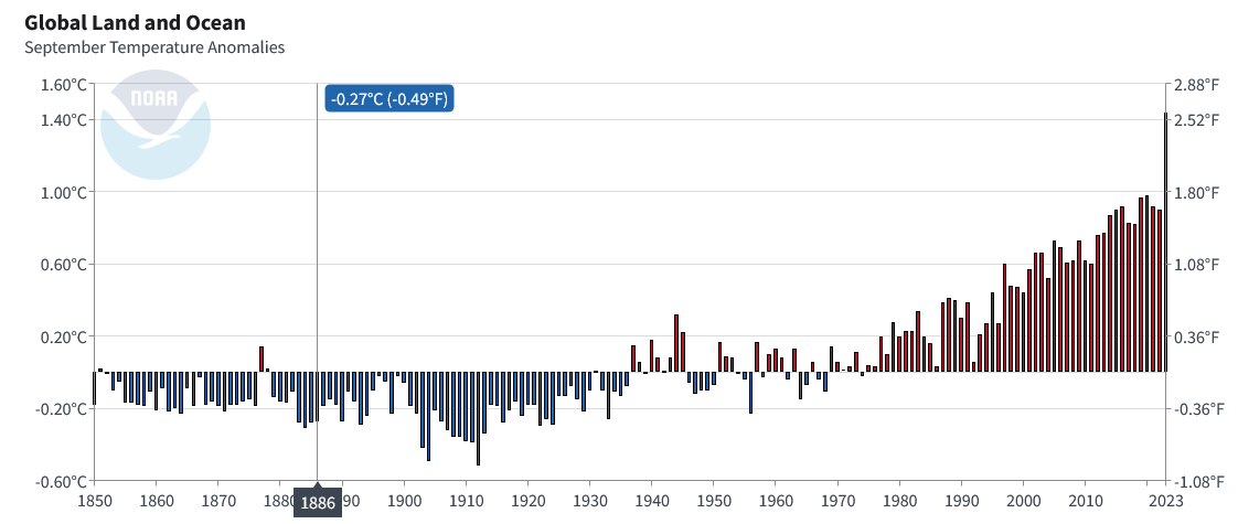
| Not surprisingly the global trend is smoother since it averages in multiple parts of Earth. But in both cases, the question is why the steep rise started perhaps in 1980 Globally but showed up more in North America in perhaps 1997 when we had the MegaNino. That seems to be the time the Pacific Decadal Oscillation changed phase to PDO Neg. |
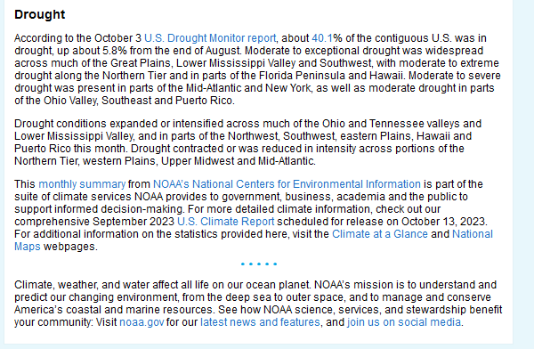
| We discussed drought recently in an article that can be accessed HERE. |
Now let us take a look at the state rankings which is where the data for each state fits within the 129 years of data in this series.
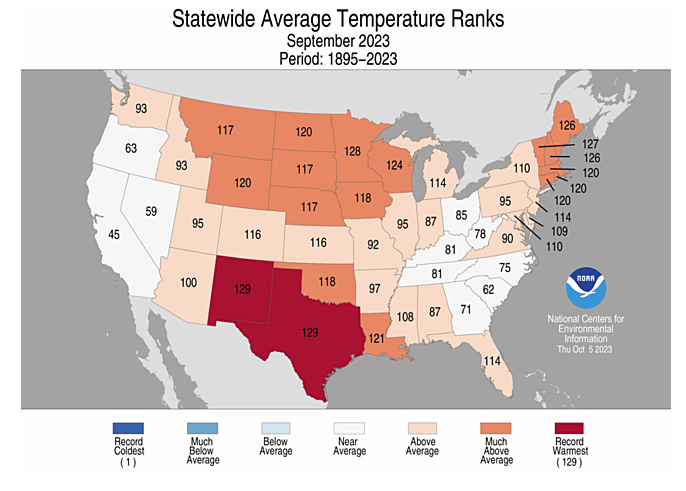
| Two states had record average temperatures and many others were very warm. |
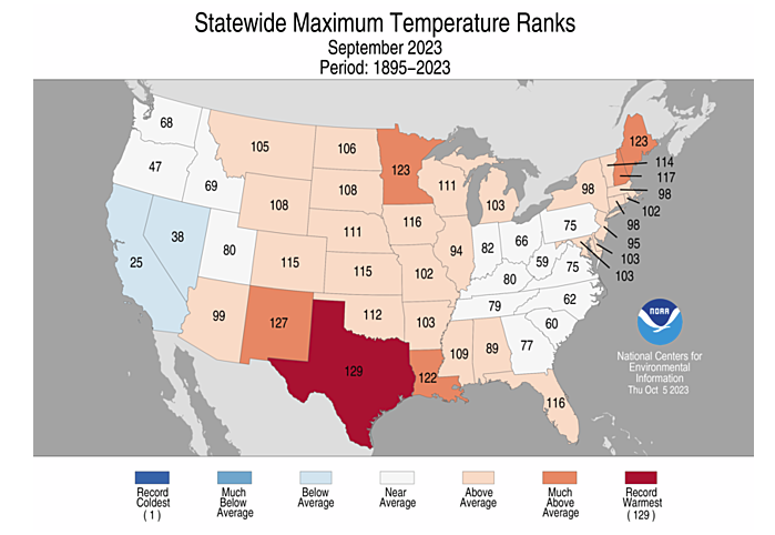
| When you look at the maximum temperatures the picture is less extreme. |
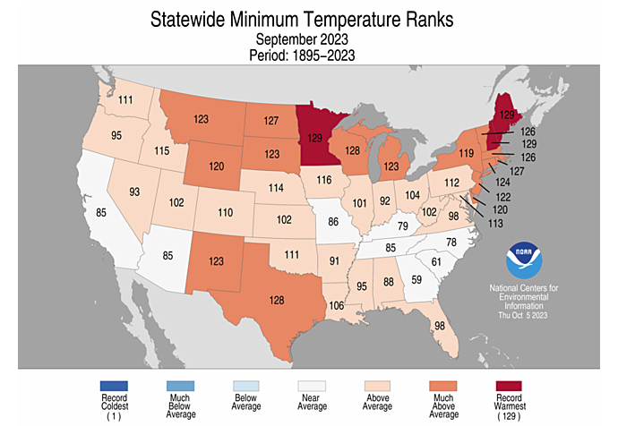
| Minimum temperatures provide a very different picture. |
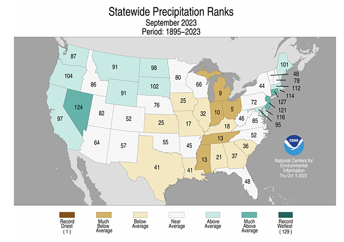
| The precipitation ranks help to explain the temperature rankings. First of all, we see the problem in the states just east of the Mississippi River. But in many states that had very warm average temperatures, the humidity was low enough that those temperatures declined quite a bit in the overnight period. |
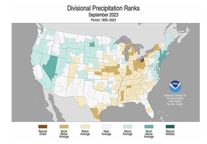
| Sometimes looking at the rankings by climate divisions sheds additional light on the subject. You can more precisely see the dry and wet areas this way. |
–
| I hope you found this article interesting and useful. |
–