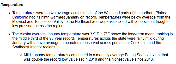
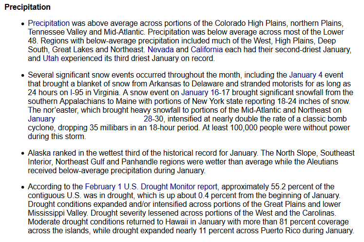
Every month NOAA issues a report assessing the U.S. Climate for that month and I receive an email that summarizes that report. The email generally does a very good job of presenting the information in the monthly report so I thought that I would provide the information that was in that email. However, I have replaced two of the graphics with different NOAA graphics.
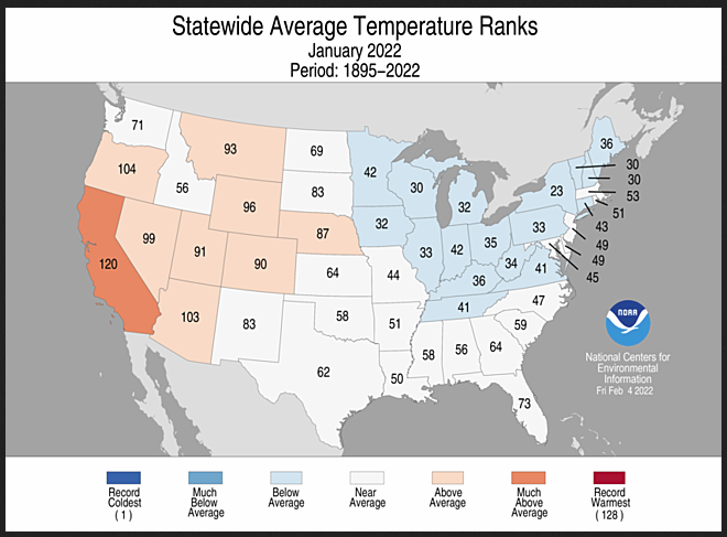
These are pretty much the same information but for temperature and precipitation rather than showing the map of the temperature and precipitation anomalies, I am showing the state rankings of their temperature and precipitation relative to the most recent 128 years of data. There are many ways to display data and I just happen to like the state ranking approach. On an overall basis, it was cool compared to recent years and dry not only compared to recent years but to the entire period of record. There was a lot of variation throughout the U.S.
The official report can be found at https://www.ncdc.noaa.gov/sotc/national/202201 and an initial report was sent out and you can find that here https://www.ncei.noaa.gov/news/national-climate-202201.
John Bateman’s report
John Bateman sends out an email that summarizes the report and I am quoting from it below and using one of the graphics from his email and two graphics from the full report.
Let’s get started. Here is how John Bateman starts his email.
Then he presents this graphic:
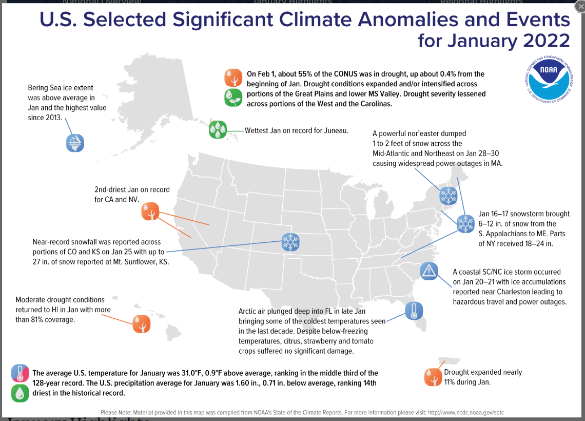
These are the events in January that NOAA thought were especially noteworthy. I am not going to comment on them because John Bateman does that below, at least for some of them.
Details regarding weather anomalies
So let us see what he has to say. In two places where he typed the date, there is a blank space but that is not missing data just a blank space that got introduced somehow.
The Bering Sea Ice information is interesting. What made the Bering Sea Ice expand?
Temperature rankings by state
The above shows the ranking of each state in the 128-year history which is considered to be the most reliable part of our data. No state had record temperatures. One state was much above average and there were eight states above average. I hope I have this right that seventeen states were below average. So how does that result in a slightly above average temperature for January? Notice that the warm states are larger than the cool states. That is one of the reasons I used this map.
Precipitation rankings by state
So how do the above bullet points translate into a dry year? Let’s take a look.
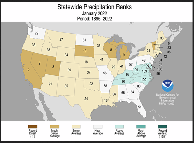
The above shows the ranking of each state in the 128-year history which is considered to be the most reliable part of our data. No state had record dryness but two states had the second driest year in their history and one had the third driest year. There are seven states with above-average wetness. White is near average and yellow, tan, and dark brown are below, much below, or record dry. So there are far more states in those categories than blue, green, and black. I have not counted all the states that were below average but there are only seven states above average or wetter. Actually, there are no states much above average or record wetness.
This simply supports the bullet points above the graphic that this was a very dry January.


