At the end of every month, NOAA updates their Early Outlook for the following month which in this case is February. They also issue a drought outlook for the following month. We are reporting on that tonight as well as some interesting information on the change in Western streamflow median levels in the new climatology versus the prior climatology. This tells us how the past three decades have changed from the prior three decades. It is in line with what should be expected and is very interesting. It suggests that on average the West is drying out but I think I also see a secondary trend where it may be getting drier to the south and wetter to the north.
Updated February Outlooks
For those who want a quick answer, here is the updated Outlook for February. NOAA uses the word “outlook” when they are forecasting deviations from normal (also known as climatology). That makes sense and it reminds me to remind everyone that this is what is being presented here: forecasted deviations from normal. And if you look at the legend and the labeling, NOAA is quite clear that this is what they are doing. Quite frankly I think this sort of map is more useful than a forecast of absolute values of temperature and precipitation for most purposes.
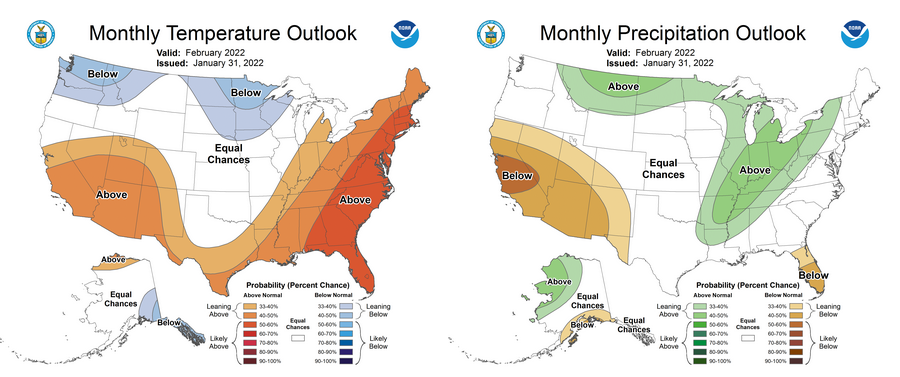
Here are larger versions of each one.
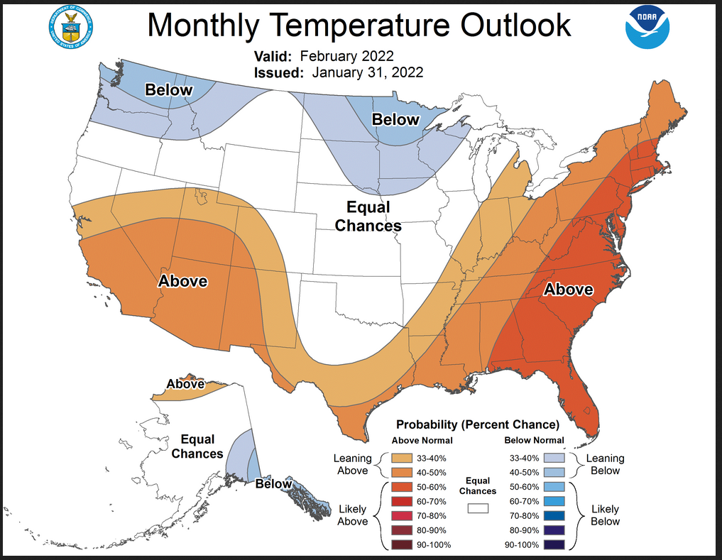
First Temperature
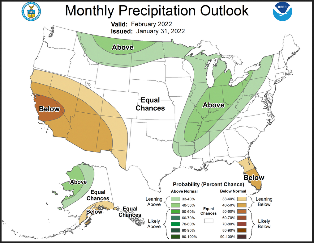
Then Precipitation
Then we look at the new Monthly Outlook plus the three-month outlook Issued on January 20, 2022
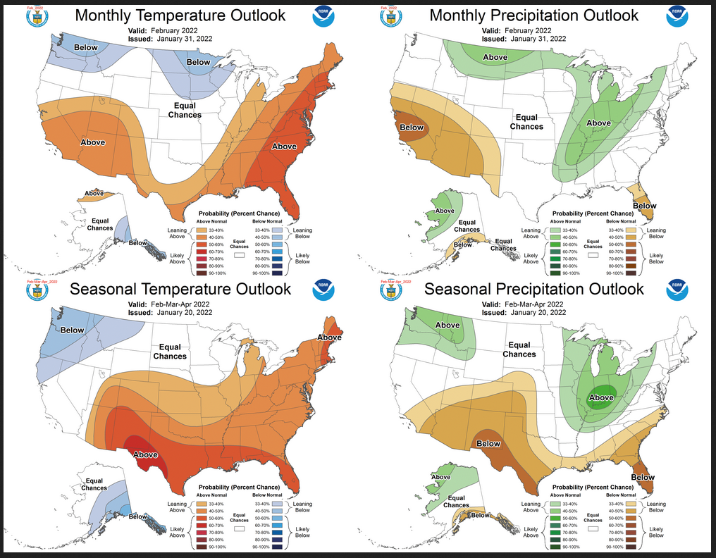
For temperature, you see a big change between the one-month outlooks and the three-month outlooks. As for precipitation, there is also some change but not as much. Does that have any significance?
There are two possibilities:
A. There is a big change coming or
B. The three-month outlook is out of date based on what we now think we know about February.
It is especially interesting because the outlooks issued on January 20, 2022, the February Outlook, and the three-month Outlook were very similar.
One way to get a handle on that is to compare the updated February Outlook with the Early Outlook for February issued on January 20.
To do that I have to do what is essentially cut and paste.
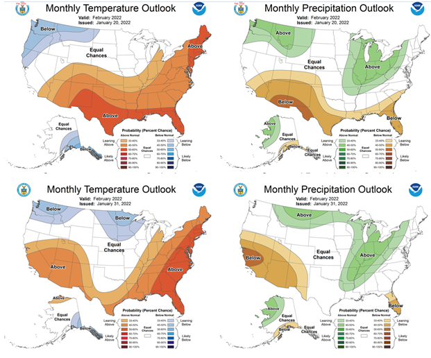
That looks like it worked. The method I used loses a little resolution but I think you can compare the two. The top is the Early Outlook and below it is the Update Outlook. There have been some changes. You can see what they are. For temperature, it looks like the Jet Stream is dipping a bit in the center of CONUS. I am not sure how to interpret the change in precipitation. Maybe the NOAA Discussion will help.
NOAA Discussion
30-DAY OUTLOOK DISCUSSION FOR FEBRUARY 2022
The updated temperature and precipitation outlooks for February 2022 reflect recent dynamical model guidance from the GEFS and CFSv2, as well as current WPC week 1 outlooks and the CPC week 2 and week 3-4 outlooks. The Madden-Julian Oscillation (MJO) is currently inactive. However the NCEP GEFS forecasts indicate possible emerging MJO activity over the Indian Ocean and progression across the Maritime Continent into the Western Pacific in the second week of February. An active MJO over the Maritime Continent could reinforce La Niña impacts. Persistent La Niña conditions over the Tropical Pacific Ocean continue to play a role in predicted climate conditions for North America. Short range dynamical model forecasts from the NCEP GEFS predict an increasingly positive North Atlantic Oscillation (NAO) in the first two weeks of February, impacting the temperature outlook in week 2. Land surface soil moisture conditions were also consulted for the updated February outlook.
The temperature outlook for February indicates increased chances of below normal temperatures for northern areas of the Pacific Northwest and Rocky Mountains into parts of the Northern Plains and western Great Lakes region, reflecting WPC temperature outlooks for the first week of the month, as well as a consolidation of GEFS and CFSv2 temperature forecasts for weeks 1 through 4. Possible below normal temperatures for parts of the Northern Tier are reinforced by the CPC Week 3-4 Outlook, as well as canonical La Niña impacts. A large area of equal chances of above, near and below normal temperatures for much of the Central Plains, as far south as northern Texas, is predicted as a result of forecasts of below normal temperatures in the first week of February followed by likely above normal temperatures by week 2, and weaker signals later in the month. Above normal temperatures are favored in the February Outlook for Central and Southern California and the Southwest, supported by consolidated dynamical model forecasts indicating increased chances of above normal temperatures following likely below normal temperatures at the start of the month. Above normal temperatures are favored from the Gulf Coast region northeast to eastern areas of the Midwest and eastward to the Atlantic Coast, reflecting temperature forecasts for early in the month, potentially associated with a positive NAO, and further supported by CFSv2 guidance for February. Inconsistencies in temperature tools for Alaska lead to most areas being forecast as equal chances of above, near and below normal temperatures. Above normal temperatures are favored for the North Slope, supported by the CFSv2 February forecast and decadal temperature trends . Below normal temperatures are favored for extreme southeastern Mainland Alaska and the Alaska Panhandle, consistent with a canonical La Niña pattern and the Week 3-4 Outlook.
The precipitation outlook for February reflects the latest guidance for the month of February, with additional weight given to the first week of the month due to greater skill relative to longer leads. The outlook is consistent with canonical La Niña patterns in most regions with the exception of an indication of equal chances of above and below normal precipitation for much of the Gulf Coast region, where a consolidation of dynamical model forecasts slightly favors above normal precipitation, primarily due to precipitation early in the month, and La Niña impacts favor below normal. Above normal precipitation is favored from the Northern Rockies into parts of the Northern Plains, consistent with precipitation tools and outlooks for weeks 1 through 4. Above normal precipitation is favored from parts East Texas northeastward across much of the Midwest into western areas of the Northeast, supported by the precipitation outlooks for the first week of February and in part by the Week 3-4 Outlook. Probabilities for below normal precipitation are increased for much of California and across the Southwest, consistent with outlooks throughout the month and CFSv2 forecasts. Below normal precipitation continues to be favored for the Florida Peninsula, consistent with La Niña conditions and the Week 3-4 Outlook. Above normal precipitation is favored for northwestern Mainland Alaska, while below normal precipitation is slightly favored for the south coast of Mainland Alaska, supported by CFSv2 forecasts and consistent with La Niña conditions and the Week 3-4 Outlook.
Assessment
I do not see enough in the discussion that reflects a change in thinking relative to March and April. But it is important to keep in mind that the three-month outlook issued on January 20 reflects the Early Outlook for February. So if February actually happens as forecast, March and April would need to be different than the previously issued three-month outlook. That is necessary for the three-month outlook to remain correct. I used to provide the formula for computing a Month 2-3 Outlook, but I doubt that anyone derived value from it. If someone wants it, they can contact me.
There are no reversals in the new forecast for February. All the changes are from above normal to equal chances (EC) or the reverse or from below normal to EC or the reverse. There are no changes from above normal to below normal or the reverse. So the changes are easily seen but not extremely significant.
Drought Outlook
Here is the newly issued Drought Outlook for February
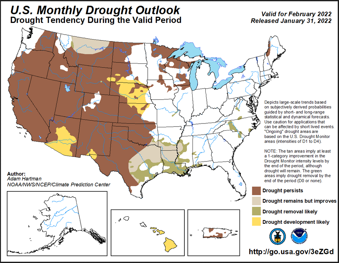
On balance there is not much change. Some areas improve, some get worse. The summary and detailed discussions which accompany this graphic and be accessed here https://www.cpc.ncep.noaa.gov/products/expert_assessment/mdo_summary.php
Visual Consistency Testing.
In the past, I have tried to determine if the monthly forecast is consistent with the concatenation of the short-term forecasts. I am going to try to do that. I do not know how to create a table in this version of WordPress, so I can not do it with images that will update. But I can do it I think by writing the analysis in MSWord and entering it here. But the images will not update.
What I am going to try to do is show the 5-day outlook, 6 – 10 day outlook, 8 – 14 day outlook, and Week 3-4 outlook. Since this is a Monday, this will give me 25 days of forecasts out of 28 days in February so it should be pretty good.
I am going to have small images that you will not be able to make larger – so I am going to provide all the links. This also means that you can update the Outlook as the month unfolds by clicking on these links. Thus you have a weather forecasting system here but you have to click on those links. Here they are:
Temperature
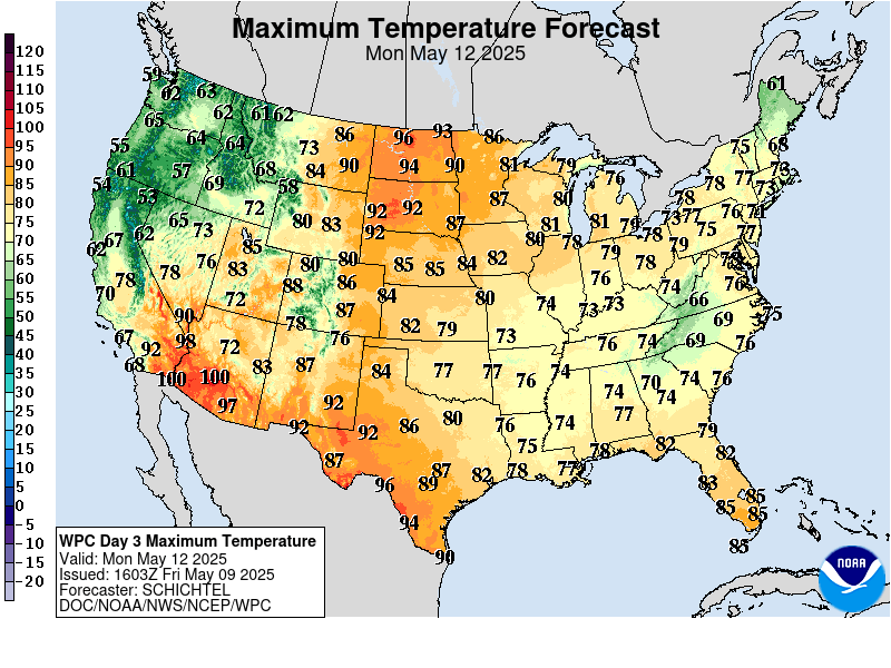
Day 3 Maximum Temperature https://www.wpc.ncep.noaa.gov/medr/DAY3_MAX_filled.gif
Days 6 – 10 https://www.cpc.ncep.noaa.gov/products/predictions/610day/610temp.new.gif
Days 8 – 14 https://www.cpc.ncep.noaa.gov/products/predictions/814day/814temp.new.gif
Weeks 3 – 4 https://www.cpc.ncep.noaa.gov/products/predictions/WK34/gifs/WK34temp.gif
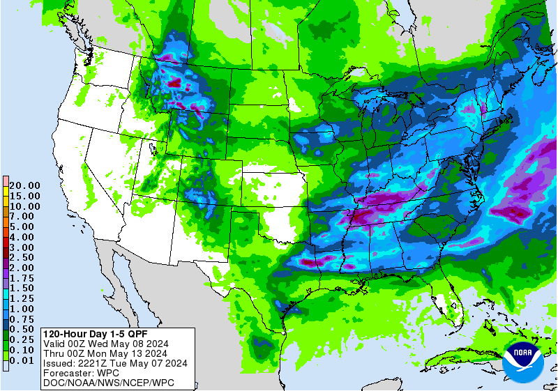
Precipitation
Days 1 – 5 Cumulative Precipitation https://www.wpc.ncep.noaa.gov/qpf/p120i.gif?1514582718
Days 6 – 10 https://www.cpc.ncep.noaa.gov/products/predictions/610day/610prcp.new.gif
Days 8 – 14 https://www.cpc.ncep.noaa.gov/products/predictions/814day/814prcp.new.gif
Weeks 3 – 4 https://www.cpc.ncep.noaa.gov/products/predictions/WK34/gifs/WK34prcp.gif
Notice that the first five days are a forecast (actual values shown) rather than outlooks (deviations from normal)
Let’s see what we get
Temperature
From left to right we show the short-term forecasts that we had at the time of publication.
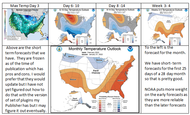
We then try to decided if the short term outlooks (one of which is a forecast) add up to the monthly forecast recognizing that we have 25 days of information and there are 28 days in February. It does not look like a great fit. But it is only one cold week so perhaps it is ok. And we do not have a short term forecast for the last three days. I might be inclined to show a bit more of the area as EC.
Precipitation
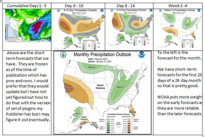
It looks like a pretty good fit.
New Streamflow Normals
The below was issued a couple of months ago (I think) but I just noticed it today.
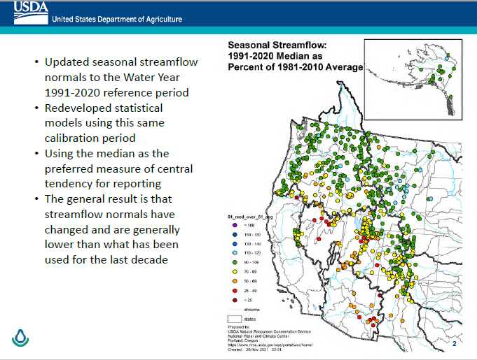
The USDA interpretation is shown on the graphic, but I have an additional interpretation. What I see is that streamflow is lower to the south and higher to the north which is what would be expected. If you look at the IPCC reports that is what you will find. Precipitation, especially winter snowpack, is higher to the north and lower to the south. This translates into streamflow. So there is nothing surprising here but it is kind of shocking to see it in a graphic.
Median vs. Average
Some of the wording is confusing. In the upper right, are they talking about median streamflow compared to average streamflow? It looks like they decided that median is better, but comparing median to average is a questionable procedure. I doubt however that it makes a lot of difference. The median basically ignores extreme values so if one believes that the distribution of values is changing, I personally would prefer the average. But it depends like many things on the purpose to which you are going to use data.
I guess I just plain disagree with NRCS that the median is more useful than the average.
For those who do not know what the median means, it means there are as many years higher and lower than the value reported. The fact is that one statistic is not sufficient to understand many things but it is pretty clear that it is drier to the south than to the north. It may be true that the net of all the readings shown is lower with the new normals.
Streamflow Interpretation
I am curious about altitude. I see some yellow and red dots farther north and wonder if they are at low altitudes.
I hope that readers can see the color coding which in the legend shows percentages. Those below 100% are the colors shown at the bottom. The colors change to over 100% as you get higher in the legend. I do not have a link for this graphic. It can be found somewhere on this website https://www.nrcs.usda.gov/wps/portal/wcc/normal/
There is also a lot of other very useful information there.